MDS Assistant is an experiment.
Hi, I'm the MDS Assistant and can help you with information from our guidelines and components.

I do not provide code and development guidance. For coding assistance, please check out our experimental MCP server.

Designing icons

The visual language used to design icons at Maersk.

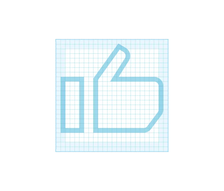
If you have an idea for a new icon please follow our icon contribution guidelines.

All icons in the Maersk Icon Library follow the visual design language described on this page.
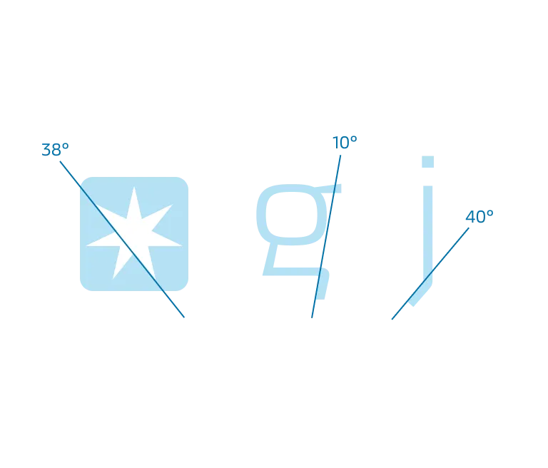
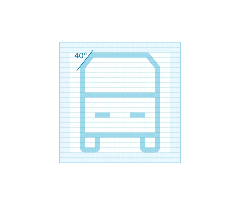
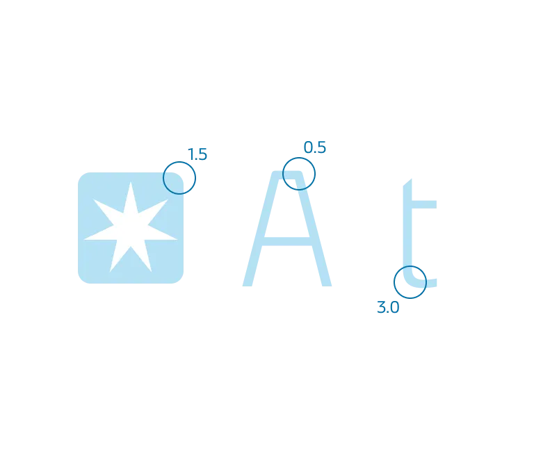
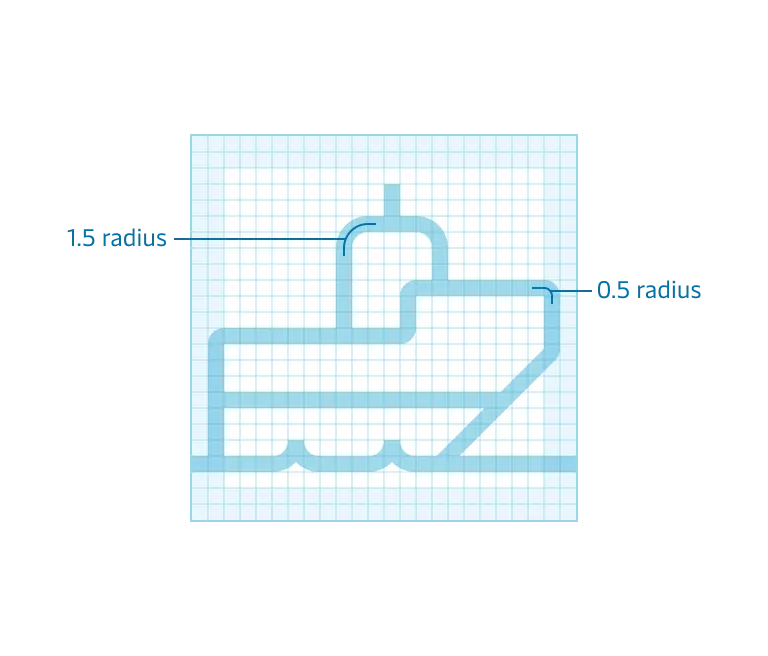
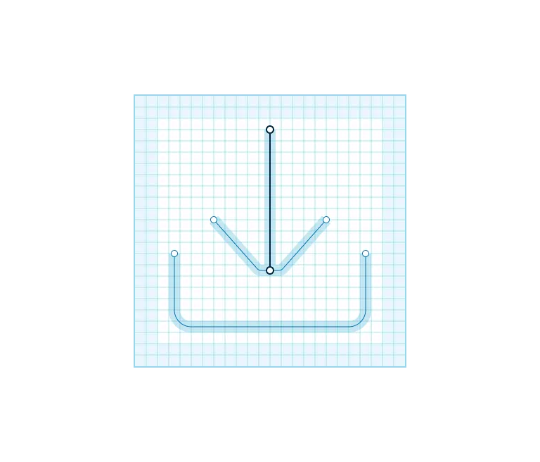
Forms and angles

The forms and line weight of our icons and pictograms are inspired by the characteristics from both our Maersk typeface and Maersk Star.

Forms from our Maersk typeface.
Forms applied to icons.
Angles from the Maersk star and our Maersk typeface.
Angle applied to truck-front icon.
Corner radius from the Maersk star and our Maersk typeface.
Corners applied to tugboat-side icon.
Use a 1px stroke for all icon sizes.
Use square end points.

Stroke alignment

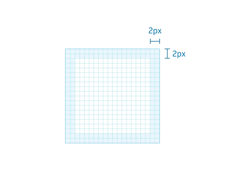
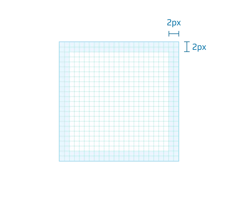
Where possible always align strokes to a full pixel, for visual balance or to centre an icon or pictogram it can be necessary to break this rule.
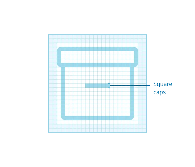
Example where it's necessary to use half pixels to centre align the icon.
To keep icon details visible, always leave a minimum of 1 pixel space between shapes.

Style

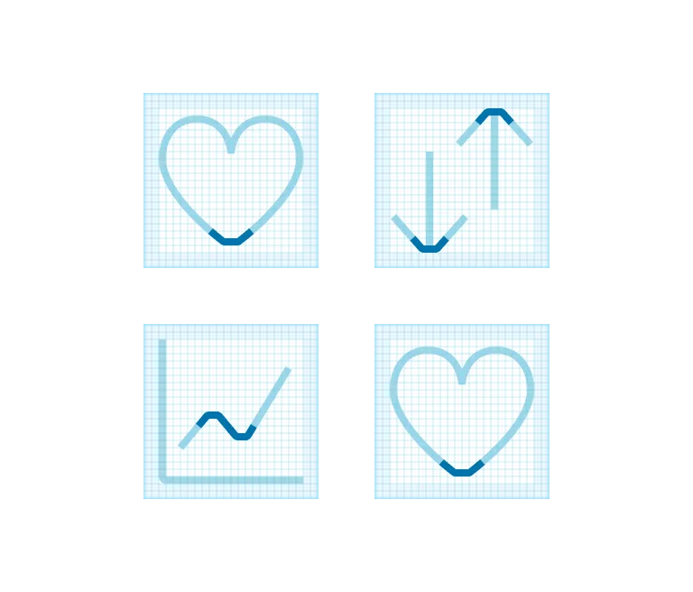
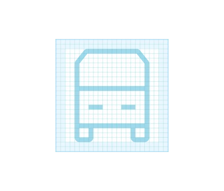
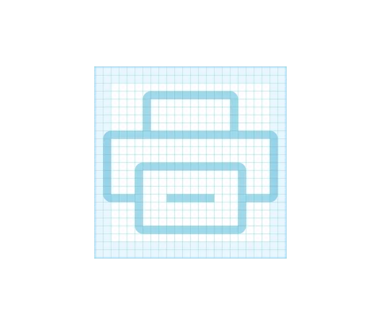
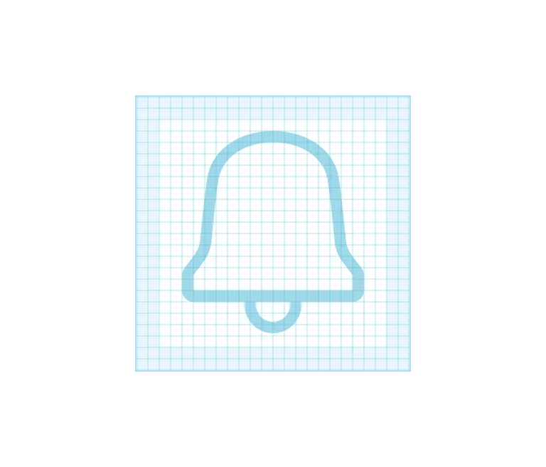
All our icons and pictograms are designed in a light outlined style, some icons will have a solid variant that can be used to clarify a state.
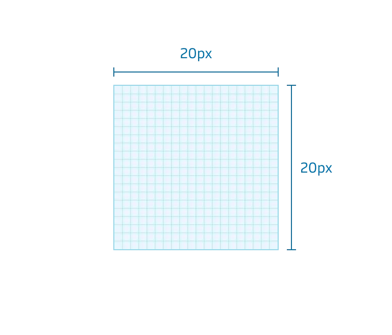
Outlined are the default style.
A solid variant can be used to help clarify a state.

Sizes

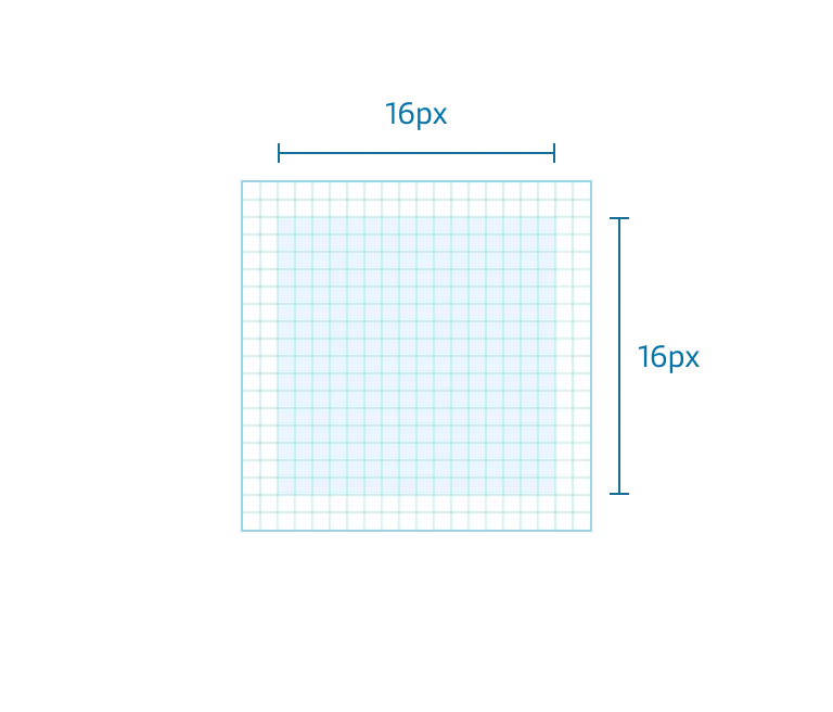
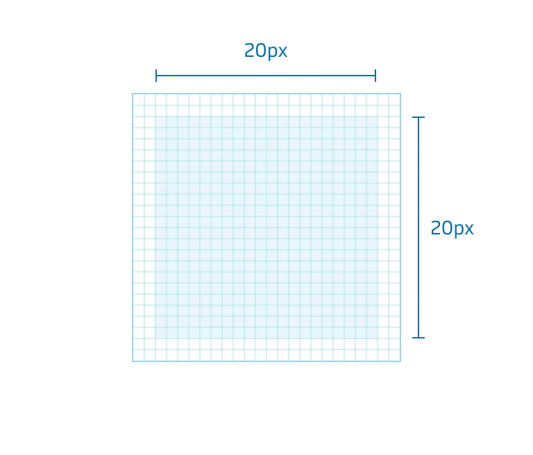
All our icons are made in two sizes, 20 pixels and 24 pixels.

20 pixel canvas at 800% scale.
24 pixel canvas at 800% scale.

All our pictograms are either 64x64 pixels or 96x64 pixels.

Icon specific guidelines

Live area

Icons will in most cases live inside the live area.

16x16 pixel live area for 20 pixel icons.
20x20 pixel live area for 24 pixel icons.

Safe area

In order to optically align some icons, you need to bring the safe area to use.

20 pixel icon.
20 pixel icon.
24 pixel icon.
24 pixel icon.
In most cases, icons fit inside the live area.
Example of an icon, taking the safe area into use.

Naming

Name icon what they are and not what actions they can do, many icons can mean or be used for different things or actions.

Search or zoom? Call it what it is, a magnifying glass.
Email or letter? Call it what it is, an envelope.

Keywords

Make it easier to find icons by adding searchable keywords, don’t use product-specific keywords.

Keyword examples: alarm, bell, notification.
Keyword examples: box, present, celebration, gift.

Clean up

When your icon or pictogram is ready, remember to duplicate it before you outline it, this will make it easier if we have to make any updates later on. Make sure you only have one layer and name it Vector, to get the best svg output remove unnecessary vector points.
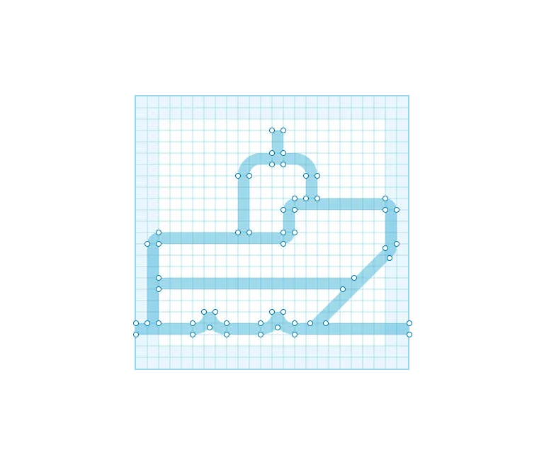
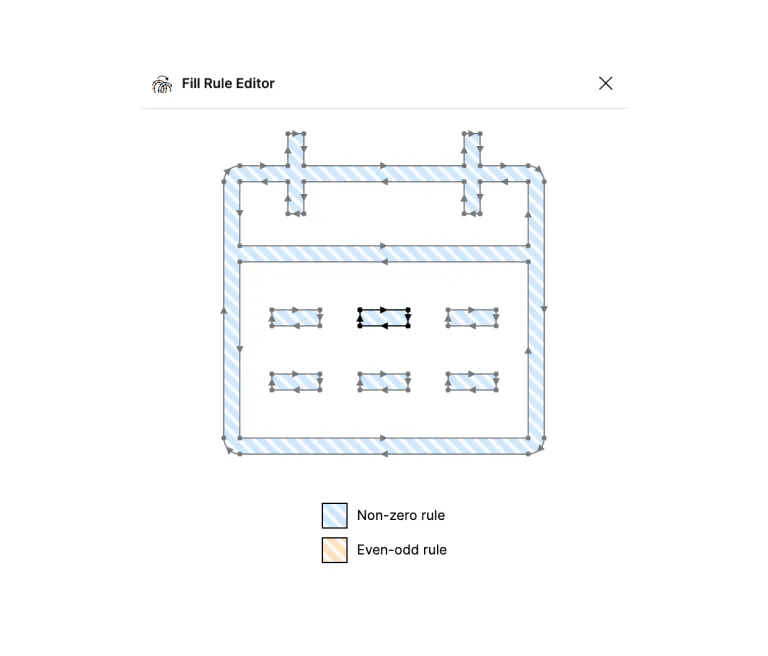
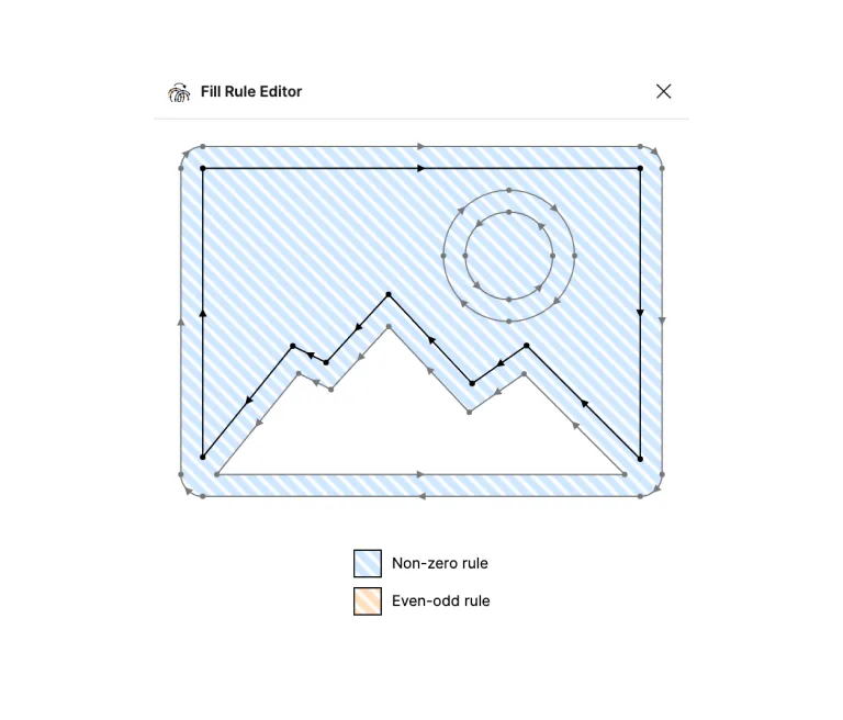
Do
Example where all unnecessary vector points have been removed.
Caution
When using flatten or outline stroke, unnecessary vector points may appear. Cleaning this up will give a better svg output.

Winding rules

One last but important step, you have to check how your winding rule are set, you can do that with the plug-in “Fill rule editor” here you want your icon or pictogram to be set to “non-zero rule”. If your icon are blue you a ready to go, if it’s orange you are using the wrong winding rule. Click the orange area to change it to non-zero/blue.

When changing an icon or pictogram from even-odd to non-zero it is possible that you will see areas being filled instead of transparent, that’s easy to fix. Click on the small black arrows to turn their direction. Two arrows going in the same direction will fill your object, and two arrows going in the opposite direction will make your object transparent.

To toggle between non-zero rule and even-odd rule simply click the blue or orange area of the icon.
Fix this fill error by clicking the inner black arrows to turn their direction.