Forms
Forms carry most of the data entry in Maersk products: booking details, container and cargo information, customs data, account creation, and settings. Their structure affects how quickly people finish a task and how accurately they enter the data.
Follow the linked component pages for guidance on individual controls.
Four terms are used throughout:
| Term | Definition |
|---|---|
| Field | One labelled form control: an input, a select, or a date field. A Checkbox Group, Radio Group, or Switch Group also counts as one field, however many options it holds, because the user answers it once. An Input Group also counts as one field. All field counts on this page use this definition. |
| Select | The control that opens a list of options. A Multi Select lets users choose more than one option. Some teams call it a dropdown; this page calls it a select. |
| Group | A set of fields under one heading or legend that together describe one subject. An address is an example: street, number, postcode, and country sit in one group. It is separate from the Checkbox Group, Radio Group, and Switch Group components. |
| Action row | The group of buttons for completing or managing the form, such as Continue, Save draft, and Cancel. It is also called Actions. Some teams call it the footer or button bar; this page calls it the action row. |
If something here is unclear, or you have a suggestion, please contact us.
Align product decisions before form design
Define the form’s product contract before choosing its layout and controls. Record these decisions in the product requirements so design, implementation, content, and testing use the same rules:
- Purpose and users: what task the form completes, who can start and complete it, and which information is necessary for that task.
- Data ownership: which product or service owns each value, which source supplies a default or prefill, and which source wins when available values disagree.
- Interruption: whether progress is saved, how long a draft remains available, who can resume or share it, and how expired or concurrent drafts are handled.
- Action consequences: what Back, Cancel, Reset, Clear all, and Skip preserve or discard, and which loss can be undone.
- Commitment and consent: which submissions need a review step, what the user commits to, and whether legal agreement needs a separate opt-in.
- Validation and availability: which rules can be checked locally, which require an owning service, and what the user can do when a required check is unavailable.
When one of these decisions is unresolved, do not let the interface imply an answer. Bring the product, service, security, or legal owner into the decision before the form reaches implementation.
Legal requirements
If the user must actively agree, use an unchecked checkbox.
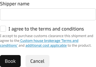
Only combine agreement and submission when Legal confirms this is allowed. Then the user has one decision instead of two.
Check with Legal whether submission counts as agreement or the user must opt in separately.
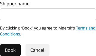
Never pre-tick a consent checkbox or disable the primary action because it is unticked. Keep the action enabled and show a validation message on the checkbox when needed.
Only ask what is necessary
Ask only for the information you need to deliver the service, whether that service is creating a customer account or placing a booking. Every extra field lengthens the form, and a longer form is harder to finish, so keep it short.
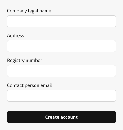
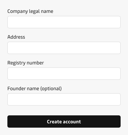
Add a field only when you can answer all of these
- Do you need the information to deliver the service?
- Why do you need it?
- What will you do with it?
- Which users need to give it to you?
- How will you check that it is accurate?
- How will you keep it up to date and secure?
Before adding a field, check whether you already hold the answer. A value you can prefill from the user’s account, their last booking, or an address book is faster and more accurate than a value you ask for again. See Prefilled and copied values.
Mark the smaller set
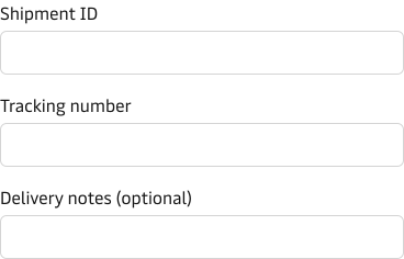
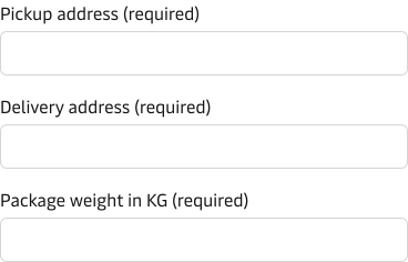
If a form asks only for what the task needs, most fields are required. Required is then the default, so mark the exceptions: the optional fields. If most fields are optional, mark the required ones instead.
Best practice for optional markers
- Put the marker on the label line, for example “Phone number (optional)”.
- Mark the smaller set. When optional and required fields are equal, mark the optional fields.
- If every field is required, use no markers.
- For a Checkbox Group or Radio Group, put the marker on the legend, not on each option, so it is announced once rather than once per option.
- Use the same marking rule on every step, if the form has multiple steps.
- Remove optional fields that the task does not need.
Choose where the form lives
Choose a page, modal, or drawer based on the task and the context the user needs.
| Location | Use it for | Action row |
|---|---|---|
| Page | The default for primary tasks, forms that may be interrupted or resumed, multi-step flows, and forms covering several subjects. | After the last field; see Placement. |
| Modal | A short, focused task that keeps the user in their current context. Use it sparingly. The task must not require information or interaction outside the modal. One group and about five fields or fewer is a starting point, not a limit. Do not split the form into steps. | In the modal or drawer footer; see Placement. |
| Drawer | Editing one item while its surrounding context remains visible, such as a container in a list. It can include several small groups when they support the same edit. About six to fifteen fields is a starting range, not a limit. | In the modal or drawer footer; see Placement. |
Choose the location based on the task, not the number of fields. Consider its place in the wider flow, the context the user needs, the risk of interruption, and what happens when they submit.
Move the form to a page when it covers several subjects, needs a review step, may be interrupted, or becomes difficult to follow while scrolling. Test uncertain choices with representative users and realistic content.
Do not put a form in a dialog. A dialog is for a decision or acknowledgement, not data entry.
Use the compact values in Spacing for forms in modals and drawers.
Modal and drawer content may scroll. Move the form to a page when the user loses the heading, group context, or fields they need to compare.
Group and space fields
Group fields by subject, name each group, and use consistent spacing within groups and larger spacing between groups to show which fields belong together. Grouping and spacing work together, so decide them at the same time.
Choose a heading or a legend from the relationship
Use a heading for a subject, such as Cargo details. Use a fieldset and legend when controls answer one question or form one value.
The Checkbox Group, Radio Group, and Switch Group components provide a legend property for grouping a series of options.
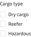
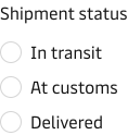
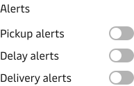
Place fields next to each other when together they form a common format, such as an address or card details. Group those fields in a fieldset and name the shared value with its legend.
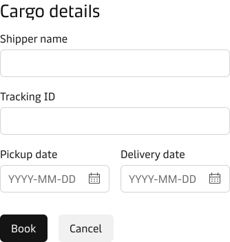
When several fields make up one value, consider combining them into a single control with an Input Group.
Choose between them by how users read and correct the parts:
- Fieldset with a legend: the parts are separately labelled fields, each with its own error, such as an address, or card number, expiry date, and security code.
- Input Group: the parts are always entered together and read as one value, such as a phone number with its country code, or a value with its unit.
If a group grows beyond about twelve fields, check whether it still covers one subject and is easy to scan. Twelve is a review point, not a limit. A shipper block can have nine fields and still be one subject; a notify party block can have three and still deserve its own group.
Split out a distinct subject when that helps. Keep related fields together when splitting them would make the entry harder to understand.
Spacing
Space form elements on the design system’s 4px spacing scale, so every gap is divisible by four.
Keep fields within a group closer together than separate groups. Leave at least as much space before the action row as between groups.
The values below are starting points. Use the compact column in modals, drawers, and other tight spaces; use the default column on most pages. Adjust for the layout, content, and user needs, but keep the spacing relationships above.
| Gap | Default starting point | Compact starting point |
|---|---|---|
| Between fields in one group | 24px | 16px |
| Group heading to its first field | 16px | 12px |
| Last field of a group to the next group heading | 32px | 24px |
| Last field to the action row | 40px | 32px |
| Between buttons in the action row | 16px | 16px |
In a tight action row, you may reduce the gap between buttons to 8px if they remain easy to tap or click.
- Match the field gap to the page grid’s row gap when the form sits in a grid. The default 24px helps the form align with the page.
- Use the same gap for the same relationship throughout the form. Different gaps between similar groups suggest a hierarchy that may not exist.
If a field has a hint or error message, measure the gap from the bottom of the lowest text element, not the input.
Name the form and its groups
- Start the form with a heading that names the task, such as “Book a shipment”.
- Name each group for what it asks, such as “Cargo details” or “Customs data”.
Consider splitting groups
Start with all groups on one page. Consider splitting them when they cover separate subjects and one or more of these applies:
- The form has more than three groups or about 25 fields.
- A group needs information from another document, system, or person.
- The task is likely to be interrupted or resumed.
- One part has different validation, permissions, or submission consequences.
To check whether subjects are separate, imagine removing one group. If the rest still makes sense as a complete request, a split may help. Party details and customs data can be separate subjects; payment method and billing address usually belong together. Every extra step adds a transition and another chance to leave, so split only as far as needed.
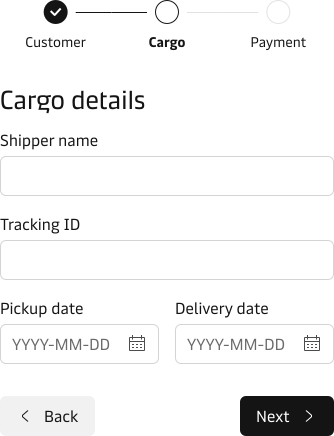
If you split the form, keep the steps in a clear order and show progress with a step indicator. Decide whether to save progress or add a review step based on interruption risk and submission consequences. See Save, resume, and review.
Keep a single reading path
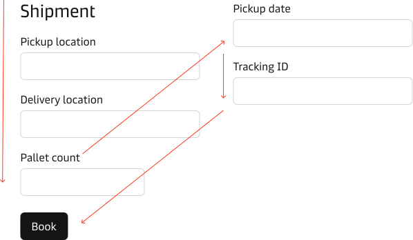
Structure a form so the user can see where it starts, what it includes, and where it ends. Achieve this by keeping one uninterrupted scan line (the straight left edge the eye follows) down the form, from the first field to the primary action.
A scattered scan line demands more eye fixations, so the user spends longer landing on the right part of the form and has trouble forming an overview of what is being asked.
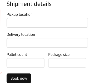
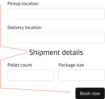
Use a one-column layout for forms. One column supports a single reading path and is easier and faster to complete. The example below shows a two-column form and the problem it creates.
One column does not mean one field per line. Fields that together form a single value, such as a date range, can sit on one line inside the column as a compound row. The column itself stays single. See Field width.
Keep a compound row on one line only while every label, value, hint, and error remains readable. On a narrow viewport or at high zoom, let its fields stack in their reading order. Keep the group label and relationship intact, and do not introduce horizontal scrolling to preserve the desktop arrangement.
Best practice for a single reading path
- Keep one scan line from the first field to the primary action: every field and every label starts on the same left edge.
- In payment and registration flows, remove everything that gives the user a reason to leave the page. Leave only the form, its help, and its actions.
Input labels
Write labels in everyday language and use consistent capitalisation throughout the form.
- Name the value, not the system field. “Consignee” is the name people use; “Party 2” is what the record calls it.
- Include a fixed unit in the label, for example “Gross weight (kg)”. If users can choose a unit, give it its own control. See Codes, references, and units.
- Name the time zone for place-specific times, for example “Gate-in cut-off (Copenhagen port time)”. Otherwise, users may assume the time is in their own time zone. See the date and time guidance.
For label wording, including which verbs to avoid and why labels take no trailing colon, see the form field label guidelines.
Label positioning
Put labels above fields by default. The user can read each label and field in one downward movement, which helps them finish faster.
At 400% zoom, top labels remain above their fields and work on small screens and with long text. Left labels need to move above their fields at that zoom without losing the connection.
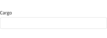
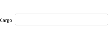
Use a left-positioned label only when a short row leaves no room above the field and users scan it rather than answer it as a question, such as a setting beside its value. See the input guidance on label position. Do not use left labels to shorten a long form: they can be hard to read on small screens or at high zoom.
Field width
Size each field to the value it expects. Its width helps users judge the length and sometimes the format of an answer. A field that is too short or too wide can make users doubt what to enter or change their answer to fit.
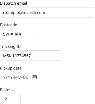
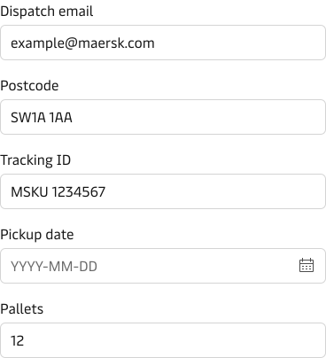
Recommended widths
Start with this six-step scale so field widths stay consistent. These are starting points, not component limits. Choose the smallest width that shows the longest realistic value.
| Width | Characters | Typical values |
|---|---|---|
| 80px | 6 | Package count, number of containers, temperature setting, a short sequence number |
| 160px | 14 | Container number, seal number, booking reference, HS code typed as a bare number, gross weight, postcode |
| 240px | 24 | City, contact name, phone number, a single date |
| 320px | 34 | Email address, vessel name, commodity, an HS code shown with its description, and any typeahead whose option label is longer than the value it stores |
| 480px | 54 | Shipper, consignee, and notify party names, street address lines |
| 100% | — | Freeform text the user composes rather than looks up: cargo description, special instructions, marks and numbers |
Check widths with realistic data, supported languages, localised numbers and dates, and narrow screens. Adjust to fit the data.
Special cases:
- A typeahead or select is sized by what it displays, not by what it stores. A port field stores
DKCPHbut shows “Copenhagen, Denmark (DKCPH)”, so it takes 320px, not 80px. The same applies to an HS code shown with its description. - A value and its unit form one field in an Input Group. Size each part to its content: the weight at 160px and the unit select at 80px.
Use 640px as a starting maximum for the form column. On narrow screens, shrink fields to fit rather than adding horizontal scrolling.
Best practice for field width
- Show the full expected value without scrolling inside the field.
- Do not use the same width for all form fields.
- Keep relative widths sensible: an email address is longer than a first name, and a port code is shorter than a consignee address.
Give help where it is needed
Give help beside a question when users may not recognise a term, understand why you need the information, or know where to find it. Choose the type of help by what they need, not by the space available:
- Hint text: keep essential short guidance visible beside the field while the user enters a value.
- Input mask: guide entry as the user types when the value has a strict, standard format.
- User-activated help: use a supported disclosure such as a Popover for background or an explanation of why Maersk needs the data, never for information needed to answer. Trigger it from an info icon or a text link next to the label. Choose a popover over hint text only when the help is optional; if most users need it to answer, use hint text.
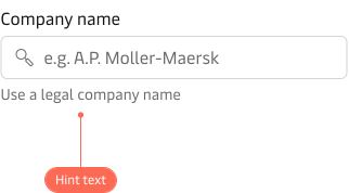
Best practice for help
- Keep help brief; every extra line adds reading time.
- Use one concise line of hint text, as set out in the input guidance. If it does not fit or repeats the label, improve the label or control instead.
- Keep the help in the context of the question it supports.
- Put essential information in the label or hint, not in user-activated help.
Codes, references, and units
Choose controls that fit the data: a list, a reference with a fixed format, or a value with a unit.
Controlled lists
Offer a fixed set of options for controlled lists such as ports, countries, commodity and HS codes, carriers, and vessels. Free text can produce values the system rejects. Show both name and code so users can recognise their choice, even when the form stores only the code.
Example: A port Typeahead shows “Copenhagen, Denmark (DKCPH)”; the form stores DKCPH.
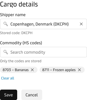
Follow the selection components guidelines: use a Radio Group or Checkbox Group for short lists, a Select for longer lists people browse, and a Typeahead for very large or search-led lists such as global ports. When users can choose more than one value, use a Multi Select or Typeahead Multi Select. A controlled list does not always need a Typeahead.
Structured references
Check container numbers and booking references against the owning product’s format. If validity depends on an existing record, check with the owning service too. State the expected format when validation fails, not just that the value is invalid.
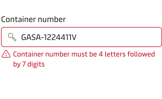
Accept values pasted from paperwork. Remove spaces and hyphens, and normalise letter case instead of rejecting the paste.
Match the unit treatment to whether it can change
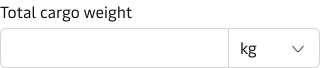
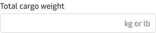
If users can choose a unit, such as kilograms or pounds, pair the value with a Select in an Input Group. A fixed suffix cannot offer that choice. Default to a unit from the user’s contract or location. Define which source wins if they disagree. Keep the unit changeable immediately to the right of the value.
If the unit is fixed, use an Input suffix and repeat the unit in the label. Follow the units of measurement guidance for formatting.
Selection dependent inputs
Some choices reveal fields for more detail. These are selection dependent inputs. Follow the selection components guidelines to choose the initial control. Then decide whether to show the extra fields inline or in another step.
Reveal a small branch inline
About three extra fields or fewer is a starting point for showing them inline. Do this when the user already has the information and the fields still make sense beside the choice. A short set of options can use a Radio Group with a legend naming the question.
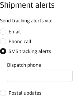
If a long option list needs a Select but reveals only a few fields, show them together directly below it.
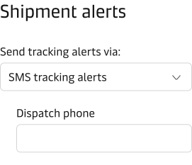
Move a complex branch to another step
Move a branch to the next step if it is long, reveals further fields, or needs information from another person or system. A long branch pushes the next decision out of view and makes the choice and its details hard to read together.
Best practice for dependent inputs
- Choose the initial control by the number and type of options, not by the fields it reveals.
- Keep the revealed fields visibly connected to the choice.
- Avoid jumping the page when fields appear, especially on mobile.
- If revealed fields reveal more fields, simplify the questions or move the branch to another step.
- When a changed answer would remove entered dependent values, warn the user before clearing them.
- Show dependent fields when needed; do not leave them disabled. See the disabled and read-only states guidelines.
Repeated entry
Booking and customs forms often repeat the same fields for each container, cargo line, party, or charge. Each repeat is a line item, called an “item” below.
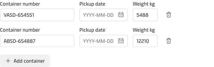
Separate entry from comparison
- To enter a few simple items: stack fieldsets. If an item needs more space or its list must stay visible, open a form on a page, in a drawer, or in a modal. See Choose where the form lives.
- To review and compare: show saved items in a Table, with an Edit action that opens the form. If stacked fieldsets become hard to scan or compare, use a focused form for entry and a Table for review. A Table is for comparison, not cell-by-cell editing.
- If the data is already in a file: offer file upload alongside manual entry, not instead of it.
Make bulk import recoverable
Check an uploaded file before creating records. Report errors by row and field so users can find and fix them. Never silently drop an invalid row. Decide whether the whole import must succeed or valid rows can be imported while others are rejected. Always state what happened:
- For a complete-operation import, say that no rows were imported and preserve the error details for correction.
- For a partial import, name the imported and rejected rows. Keep rejected values and errors so users can correct them without re-entering successful rows.
Keep manual entry available for small corrections or items the file cannot represent.
Prefilled and copied values
Prefill long forms where possible. A returning customer should not have to re-enter their shipper details. Use browser autofill for stable personal details such as name, email, phone number, and address. Use product prefill for Maersk-held or task-specific values such as a shipper, previous booking, saved template, or commodity. Follow the Input autofill guidance for fields the browser can recognise.
Show that a value was prefilled, and where it came from
Users may submit outdated values they did not notice. Mark prefilled groups and name the source, such as “Filled from your last booking”. Keep all fields editable.
Ask users to review prefilled values that are sensitive, legally or financially consequential, or hidden in a collapsed summary. Visible, low-risk values that are easy to change do not need a confirmation step.
On shared devices, do not show someone else’s recent values or booking history. Let users clear prefilled values, and check them again when a saved form is resumed.
Copy between groups with an explicit control
If two groups often share values, such as shipper and notify party, add a Checkbox to the second group labelled “Same as shipper”. Checking it copies the shipper values into visible fields so users can check and edit them. Editing a copied field does not uncheck the box, and unchecking it keeps the copied values instead of clearing them.
If the source changes later, leave copied values in place and tell the user they no longer match. Do not overwrite edits by copying again automatically.
Actions
Give each action row one primary action that moves forward or completes the task. Give supporting actions secondary or tertiary emphasis.
In an open page form, apply the hierarchy from the Button guidance:
- Primary: Filled. The single main action, such as Continue or Confirm booking.
- Secondary: Outlined. A supporting alternative, such as Back, Save draft, or Cancel when it is the only alternative.
- Tertiary: Plain. A third, repetitive, or low-emphasis action, such as Reset, Clear all, or Skip this step.
- Cancel: Outlined when it is the only alternative to the primary action. Plain when another secondary action, such as Save draft, is present.
| Example actions | Variants | Why |
|---|---|---|
| Confirm booking, Cancel | Filled, Outlined | The commitment is primary; leaving the form is secondary. |
| Continue, Back, Save draft | Filled, Outlined, Outlined | Moving forward is primary. Back and Save draft both protect the user’s work, so both are secondary. |
Choose emphasis by the task, not the action’s position. Name each action for what it does, such as “Confirm booking” rather than “Submit”. See the button label guidelines.
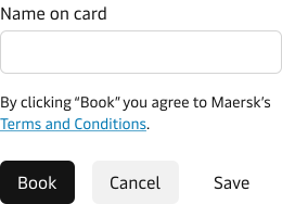
The hierarchy has three levels. If you need more than three actions, move less-used actions next to the content they affect or into another suitable control. Do not fill the row with Plain buttons.
Placement
On a page, place the action row after the last field and align the primary action with the form column’s left edge, not the viewport’s. Put it first in the reading and tab order after the fields, with related secondary and then tertiary actions beside it. Do not pin the row to the viewport.
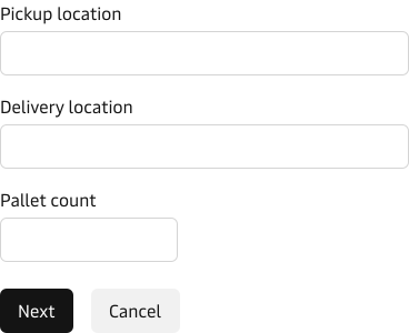
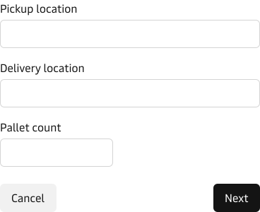
In a modal or drawer, keep the actions in the modal or drawer footer. Follow the Button pattern: put the primary action on the right, after the secondary action, and use neutral Filled rather than Outlined for the secondary. Keep the visual and keyboard order consistent. Do not apply the page-form alignment rule to these contained footers.
Keep Reset and Clear all low-emphasis and near the content they affect where possible, rather than placing them between completion actions.
For what Back, Cancel, Reset, Clear all, and Skip preserve or discard, see Protect entered work.
Save, resume, and review
Decide whether to save progress or add a review step based on the cost of interruption and the consequences of submitting. A multi-step form does not automatically need both.
Save progress when interruption would be costly
Save progress when a form is long, users must fetch information, work crosses shifts or sessions, or losing entries would be costly. A booking may need a rate check or a colleague’s customs reference. If automatic saving is available, save when the user leaves a step. Keep Save draft as well when users need to decide when others can see their work, or when your research shows they do not trust saving they cannot trigger.
Show these as distinct states:
- Saving: a save is in progress.
- Saved: the latest changes are stored.
- Not saved: there are changes since the last save.
- Save failed: a save attempt returned an error.
Show the last save time and where to find the draft near the action row. If saving fails, keep the entries, say the latest changes were not saved, and offer a retry. Product and security owners decide draft retention, access, and how to handle concurrent edits.
Protect entered work when an action leaves or clears the form
Back to an earlier step, including browser Back, must keep all entered values. If leaving the form would discard meaningful unsaved work without a reliable undo, confirm first: say what will be lost and offer Continue editing and Discard changes. A Dialog can ask for this decision. Otherwise, leave without a warning.
Confirm Reset or Clear all as destructive if it would irreversibly erase entered values, using the Button guidance. Offer undo instead when values can reliably be restored.
Keep entered values after Skip if the user may return; otherwise, warn before clearing them. Never delete entered data silently.
Review consequential submissions
Add a review step before a financial, operational, legal, or hard-to-reverse commitment, such as submitting a booking. A short, low-risk form may submit directly, even if it has several steps.
If submission fails, keep the review and entered values. Tell users whether to retry, edit, save, or return later.
Validation, errors, and success
Do not show errors before users finish entering a value. Check standalone values, such as a container number’s format, when they leave the field. Check rules that depend on other fields or a server response, such as rate availability, on submit.
Once an error appears, check as the user corrects it and clear the error when the value is valid. See the Input error state for field behaviour and the error messages guidelines for wording.
Separate invalid data from an unavailable check
Show progress while checking with a service by using loading states. If a value is invalid, mark its field and say how to fix it. If the service is unavailable, keep entered values, explain the outage above the form, and offer a retry. Do not mark a field invalid because a check failed.
If the user lacks permission or cannot finish this session, show the values read-only and say who can act, rather than leaving an editable form.
Summarise the errors when there is more than one
After a failed submission, show an error summary if several fields are invalid, an error is on another step, or the first error is out of view from the action row.
Use an error-appearance Notification above the first group. Give the count and link to affected fields, or steps in a multi-step form. Keep fixes beside the fields. Open collapsed items with errors or show an error count on each.
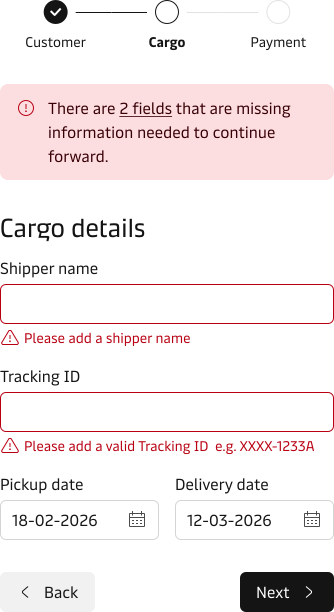
Update the count after each attempt and remove the summary when all errors are fixed. Move keyboard focus to the summary when it appears, or to the first invalid field if there is no summary. Test the links and focus: the Notification does not provide them for the form.
Prevent duplicate submissions
For consequential submissions, the product and owning service must prevent duplicate records from repeated requests. A loading button stops a second click, but not a refresh, lost connection, or repeated network request.
After a lost connection or timeout, check whether the submission succeeded before reporting failure. If it did, show confirmation and its reference. If the result is still unknown, keep entered values, explain how to check, and offer a retry only if the service can prevent duplicates.
Confirm a successful submission
Confirm that submission succeeded. See the system feedback guidelines to choose a Notification, Toast, or confirmation page.
Best practice for success messages
- If you use a Notification or confirmation page, place the success message prominently at the top of the page.
- Show the created reference, such as the booking number.
- Say what happens next and link to it, such as the new booking.
Accessibility
Check accessibility across the whole form. Follow MDS component pages for individual controls.
- Label fields and groups. Give each field a visible label, not just a placeholder. Give related groups a heading or legend, with “(optional)” on the legend rather than each option. See the Input guidance.
- Show errors without relying on colour. An invalid field needs a message and icon, not just a red border.
- Keep reading and keyboard order aligned. Headings, fields, and actions should follow their visible order. Fix the layout rather than changing individual tab positions.
- Move focus to errors after a failed submission. Focus the summary, or the first invalid field if there is no summary.
- Test at 400% zoom for WCAG 2.2 criterion 1.4.10 (Reflow). Labels, values, help, errors, and actions must remain readable and connected without horizontal scrolling.
- Test with a keyboard and supported assistive technologies.
Related guidelines
- Selection components: choosing between radio, checkbox, switch, select, and typeahead.
- Input masks: guiding entry through a strict format.
- Disabled and read-only states: when a control should be unavailable, and how to say so.
- System feedback: choosing the component that carries a message.
- Input Group: composing a value with a related unit or action.
- Labels: wording for field labels and button labels.
- Error messages: writing the message itself.
- Units of measurement: writing and displaying units consistently.
- Number localisation: formatting numbers for the user’s locale.
- Date and time: asking for and displaying dates, times, and time zones.