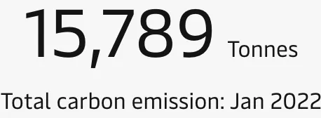
Big number chart
Simple text and numbers can be a great way to communicate when you have only a few important data points to share. Multiple big number charts can be displayed in a grid where each tile displays the value of a certain category.
Best practice
Provide a short, small title
Use a few descriptive words for the title and use a smaller font than that of the value.
Use a big and consistent font for the values
Choose a large font size to display the value. When there are several big number charts on a dashboard, ensure that they all use the same font size to create a consistent appearance.
Abbreviate values
Don’t include more precision than the user needs when displaying numbers.
Show contextual information
To provide context to the value, you could include the metric from a previous period, or use a sparkline to show how the metric has performed over a period of time. Another technique is to include the average value or previous highs and lows. If you’re working towards a goal, include the target as well as your current progress.
Add warnings
You can add warnings (colours, icons, etc.) when a metric is above or below a certain threshold to make it easier to spot problems.