MDS Assistant is an experiment.
Hi, I'm the MDS Assistant and can help you with information from our guidelines and components.

I do not provide code and development guidance. For coding assistance, please check out our experimental MCP server.

Scatter/bubble chart

Use scatter and bubble charts to present patterns in large sets of data (linear or non-linear trends, correlations, clusters, or outliers).

Please reach out to the contributors at the bottom of this page if you have any questions or feedback.

These charts are useful to present relationships and patterns in data, but not for comparing exact values. The more data you include, the clearer the patterns become.
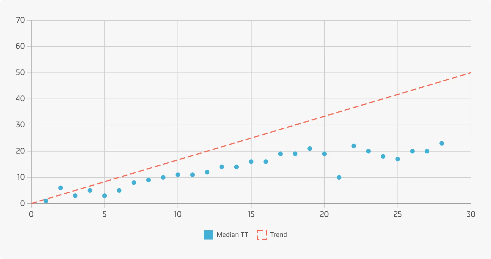
Scatter Chart

A scatter chart is primarily used for correlation and distribution analysis. It is good for showing the relationship between two different variables where one correlates to another (or does not).
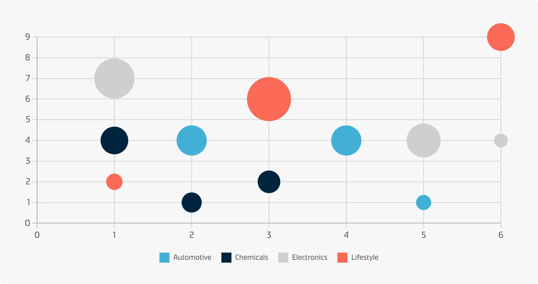
A user who wants to get an overview of the relationship between 'free time granted' (the amount of time allotted for picking up a container) and the 'actual turn time' (the actual duration of the pick up).

Bubble Chart

A bubble chart is a great option if you need to add one more dimension to a scatter plot chart. Scatter plots only display the relationship between two variables, but you can add bubble size as the third variable and thus enable comparison. Bubble charts are generally considered to be more visually appealing than scatter charts.

A user who wants to explore the relationships between Maersk revenue, year growth, and number of customers per region. Each dot in the bubble chart corresponds to a single data point (i.e. country within a continent). The variables' value for each point are indicated by the horizontal position (revenue), vertical position (Maersk yearly growth) and the dot size (number of customers).

Best practice

Add a trend line

When a scatter plot is used to look at a predictive or correlational relationships between variables, it can be useful to add a trend line to the plot showing a calculated best fit to the data.

Start the y-axis at zero

Include the zero line of the y-axis to represent the data accurately.

Avoid overplotting

Especially when dealing with bubble charts overplotting should be avoided so data points don’t overlap to a degree where it is difficult seeing relationships between variables. This could be achieved by sampling only a subset of data points, reducing point size of the bubbles or making the bubbles semi-transparent.

Allow the user to see the exact values

Add value labels if bubbles are similar in size. If a bubble chart contains many bubbles it can be helpful to add tooltips on hover to display all the values associated with individual data points.

With contributions from:

Thomas Bove