Stacked bar chart
The stacked bar chart extends the standard bar chart from looking at numeric values across one categorical variable to two. Each bar in a standard bar chart is divided into a number of sub-bars stacked end to end, each one corresponding to a level of the second categorical variable.
If the focus of your chart is to compare multiple parts across all your totals with each other, consider using a Clustered bar chart instead.
A stacked bar chart can be displayed with vertical bars (primary categories on the horizontal axis) or horizontal bars (primary categories on the vertical axis):
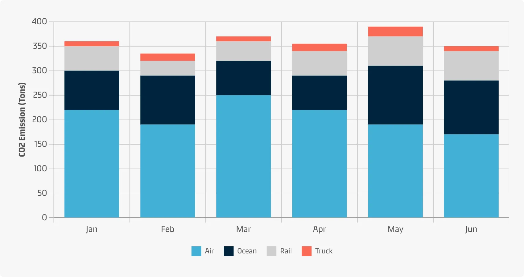
Vertical
Vertical bar charts are useful when you’re graphing ordinal variables (i.e. when subcategories have a natural sequence). They are useful to compare different categorical or discrete variables as long as there are not too many categories to compare or if their labels are long.
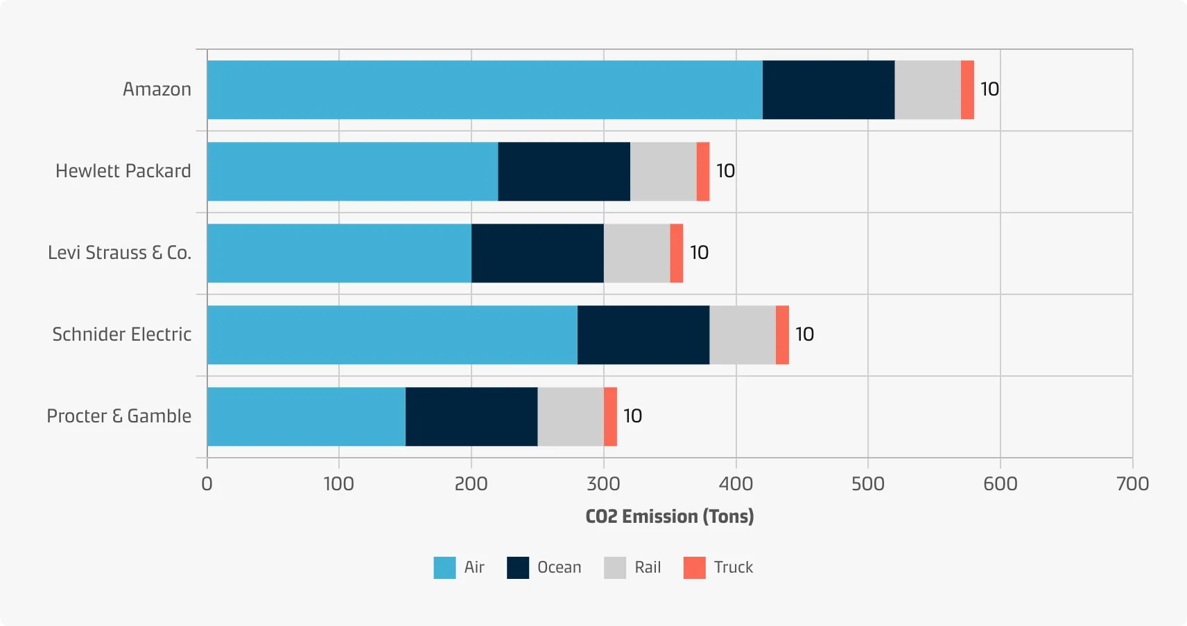
Horizontal
Horizontal bar charts are especially useful if you have many categories or if the category names are long because there is plenty of space for the labels when they are displayed below (rather than beside) each other.
Best practice
Minimise the amount of sub-bars
Do not use too many sub-bars within a column (max 3 - 5) otherwise it can get very messy very quickly.
Order the category levels
With a stacked bar chart, you will need to consider the order of category levels for both categorical variables to be plotted. The rule of thumb for standard bar charts can be applied in both variables: order the bars from largest to smallest (or vice versa) unless there is an intrinsic order of levels.
Use stacked vertical bar charts when you have few totals
If you have many categories (10 or more), consider a stacked horizontal bar chart, a table, or other chart types that display data in rows.
Use stacked vertical charts when the categories have short labels
Long labels do not fit well below the columns of a vertical stacked bar chart, especially if you have many of them. Consider a horizontal stacked bar chart instead.
Choose effective colours
Using different colours to distinguish secondary variable levels is crucial for a stacked bar chart to make sense. Make sure that the choice of colour palette assigned to each categorical level matches the variable type (i.e. a qualitative palette for purely categorical variables and sequential or diverging for variables with a meaningful order). See the Chart style guide and Colour best practice pages for additional guidance on appropriate colour choices within the Maersk colour palette.