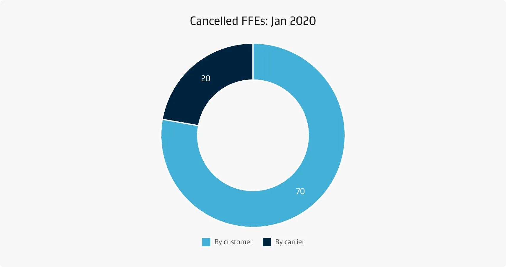
Pie/donut chart
Pie charts are not meant to compare individual sections to each other or to represent exact values (you could use a bar chart for that). In a similar vein, it is hard to compare pie slices across pie charts.
Best practice
Limit the number of slices
If you have more than about five categories, consider using a different chart type. Another option could be lumping more small slices into a single ‘other’ slice, preferably coloured in a neutral grey.
Include annotations
It is very difficult to discern exact proportions from pie charts - therefore, annotations are an important addition to pie charts.
Consider the order of slices
A typical ordering goes from the largest slice to the smallest slice, which is very useful when there are categories with very similar values. It is conventional to start the chart from the top (12 o’clock), since it intuitively matches how we read from top to bottom and how we think about the progression of time on a based on our experience with analogue clocks and watches.
Place the total in the centre of the donut
The centre of a donut chart can be used to show the total combined value of all the variables.