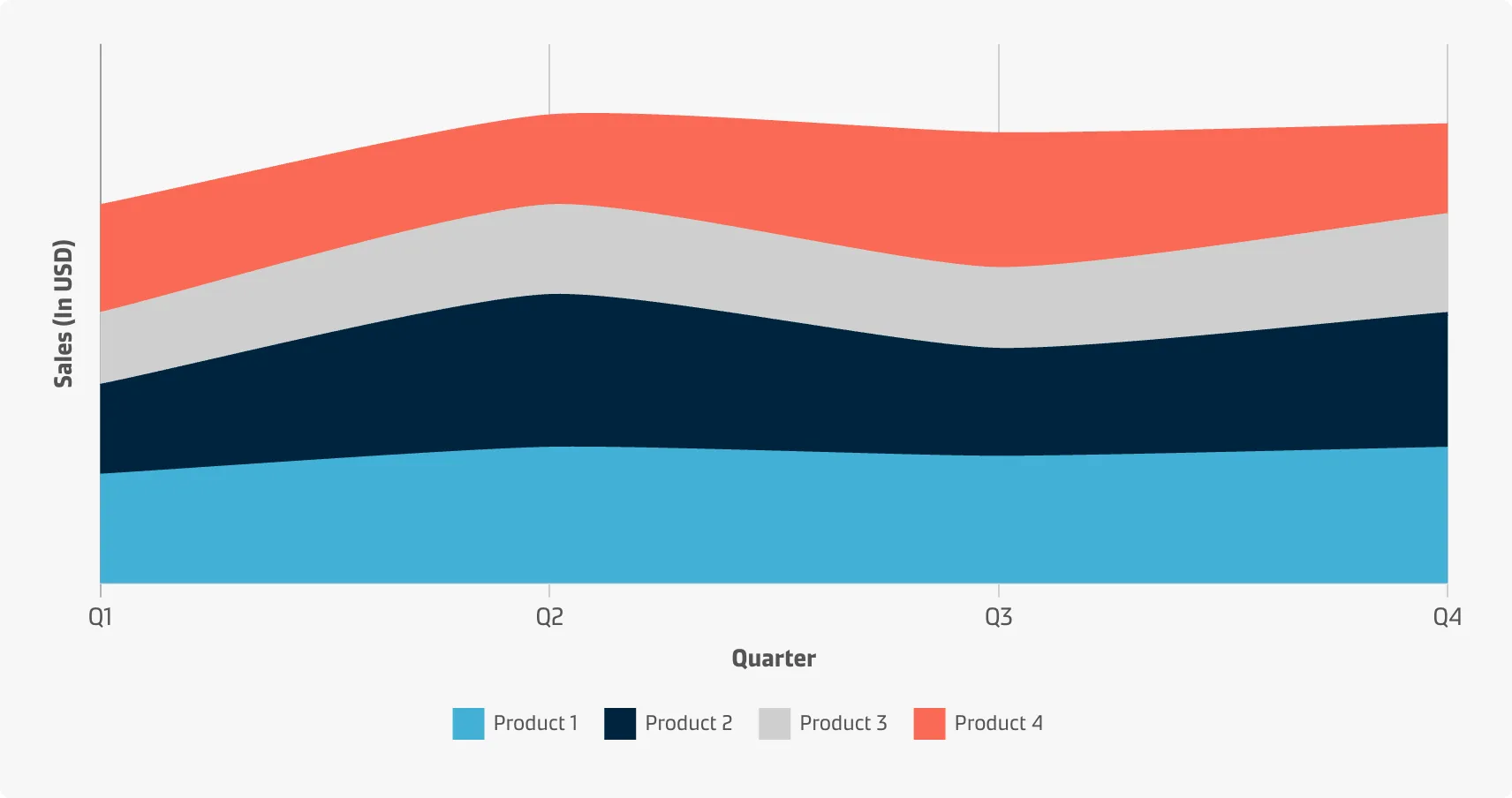
Stacked area chart
You can use a stacked area chart when you want to track not only the total value but also want to understand the breakdown of that total by groups. Comparing the heights of each segment of the curve allows you to get a general idea of how the subgroups compare to each other in their contributions to the total. Generally, when the term ‘area chart’ is used, what is actually implied is the stacked area chart.
Best practice
Compare just a few categories
Stacked area charts might be colourful and fun, but you should use them with caution because they can quickly become messy and hard to read. Don’t use them if you need an exact comparison and don’t stack together more than three to five categories as a rule of thumb.
Include a zero-baseline
While a line chart is not restricted to requiring a zero-baseline, the addition of shading means that the heights of the coloured regions will be used to compare the size of each group’s values. Thus it is advised to show the zero-baseline.
Consider the order of categories
A good rule of thumb is to put the largest or most stable categories at the bottom and the smallest or most volatile categories at the top.
Group tiny values
If it is meaningful for the story of the data, consider combining more tiny values into a bigger umbrella category to prevent clutter.
Add annotations and explanations
Add clarifying information to your graphs to make them easier for the users to interpret.