Bar chart
Vertical
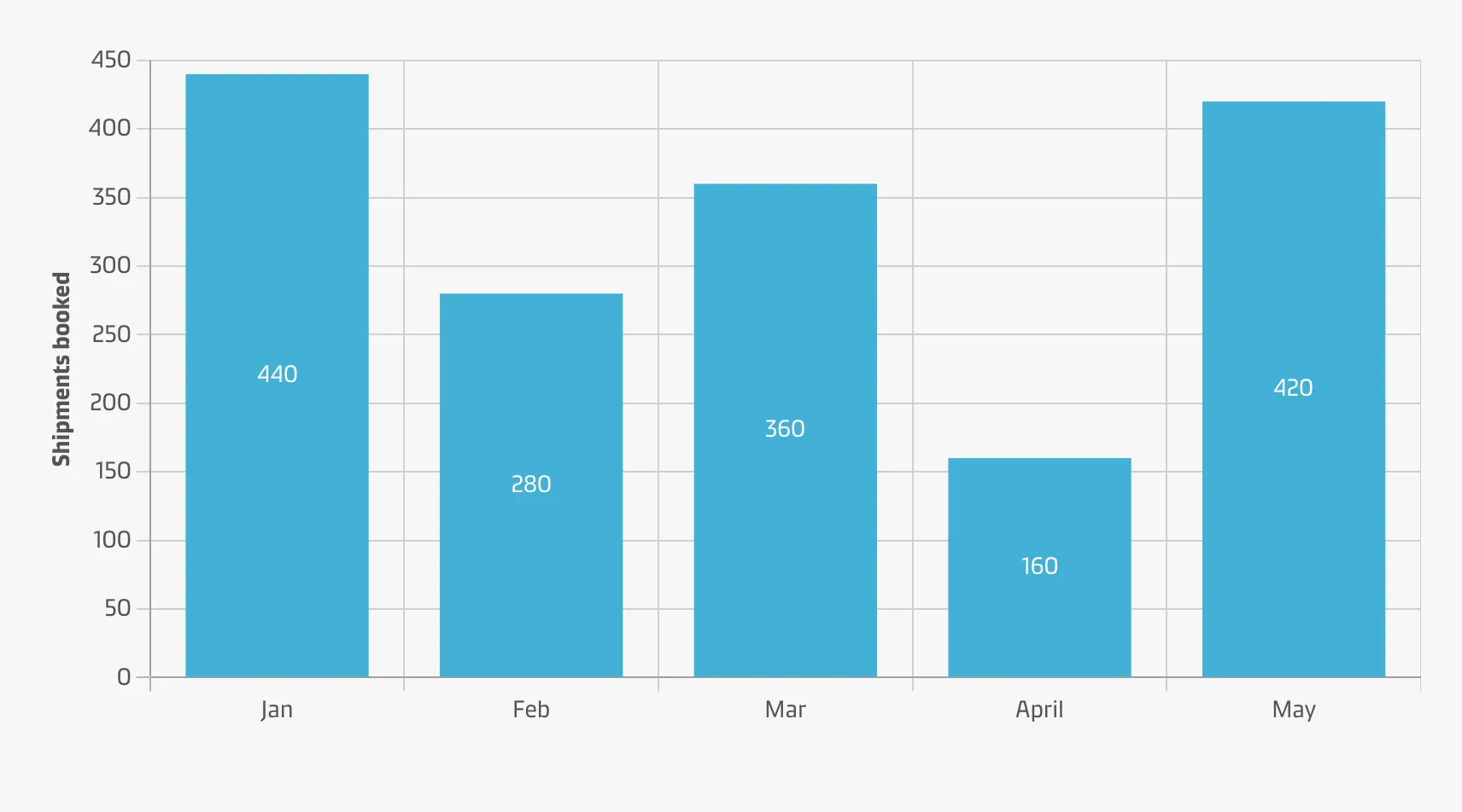
Vertical bar charts are useful when you’re graphing ordinal variables (i.e. subcategories have a natural sequence). They are useful to compare different categorical or discrete variables as long as there are not too many categories to compare or their labels are long.
Horizontal
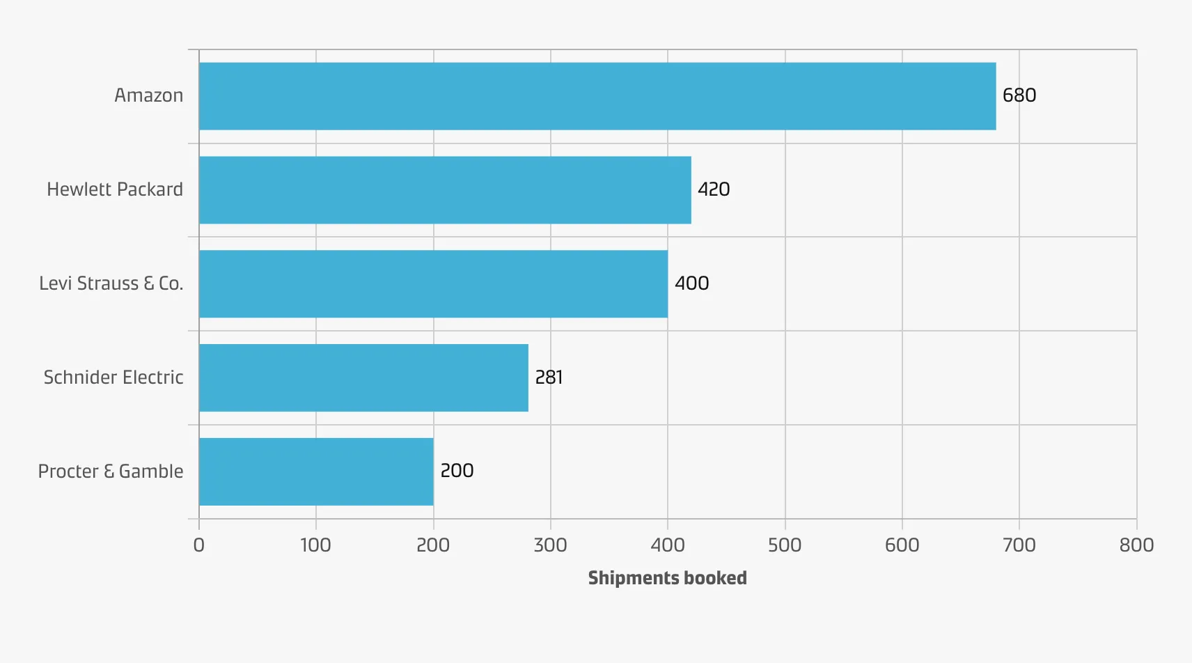
Horizontal bar charts are especially useful if you have many categories or if the category names are long because there is plenty of space for the labels when they are displayed below (rather than beside) each other.
Best practice
Consider the amount of categories
Use vertical bar charts for comparison if the number of categories is quite small.
Use colour wisely
Certain visualisation tools will colour each bar differently by default, but this can distract the reader by implying additional meaning where none exists. Instead, colour should be applied with purpose (e.g. to highlight specific columns for storytelling).
Maintain a zero line
Include the zero baseline to represent the data accurately. Our eyes are sensitive to the area of bars on a chart. If those bars are cut off, the viewer might draw the wrong conclusions.
Order category levels consistently
It is conventional to sort the bars from longest to shortest or vice versa. While it is always possible to compare the bar lengths no matter the order, this can reduce the burden on the reader to make those comparisons themselves.
Don’t make users tilt their heads
To improve readability try to write labels horizontally (not vertically), whenever possible.