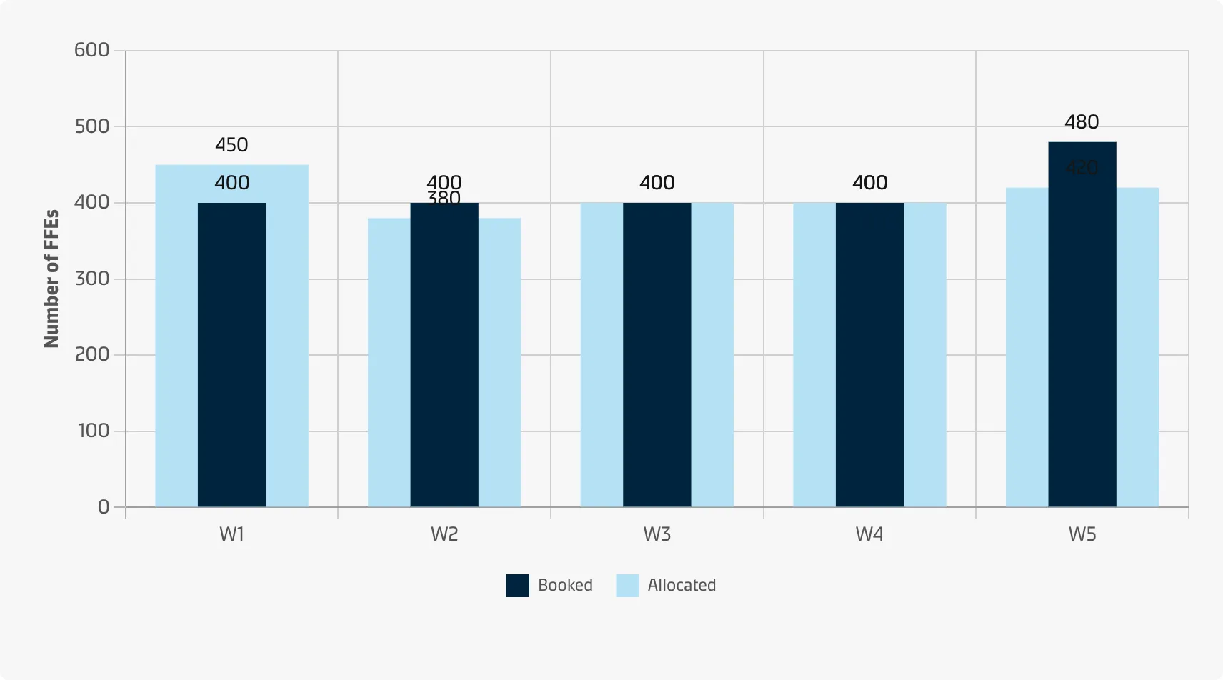
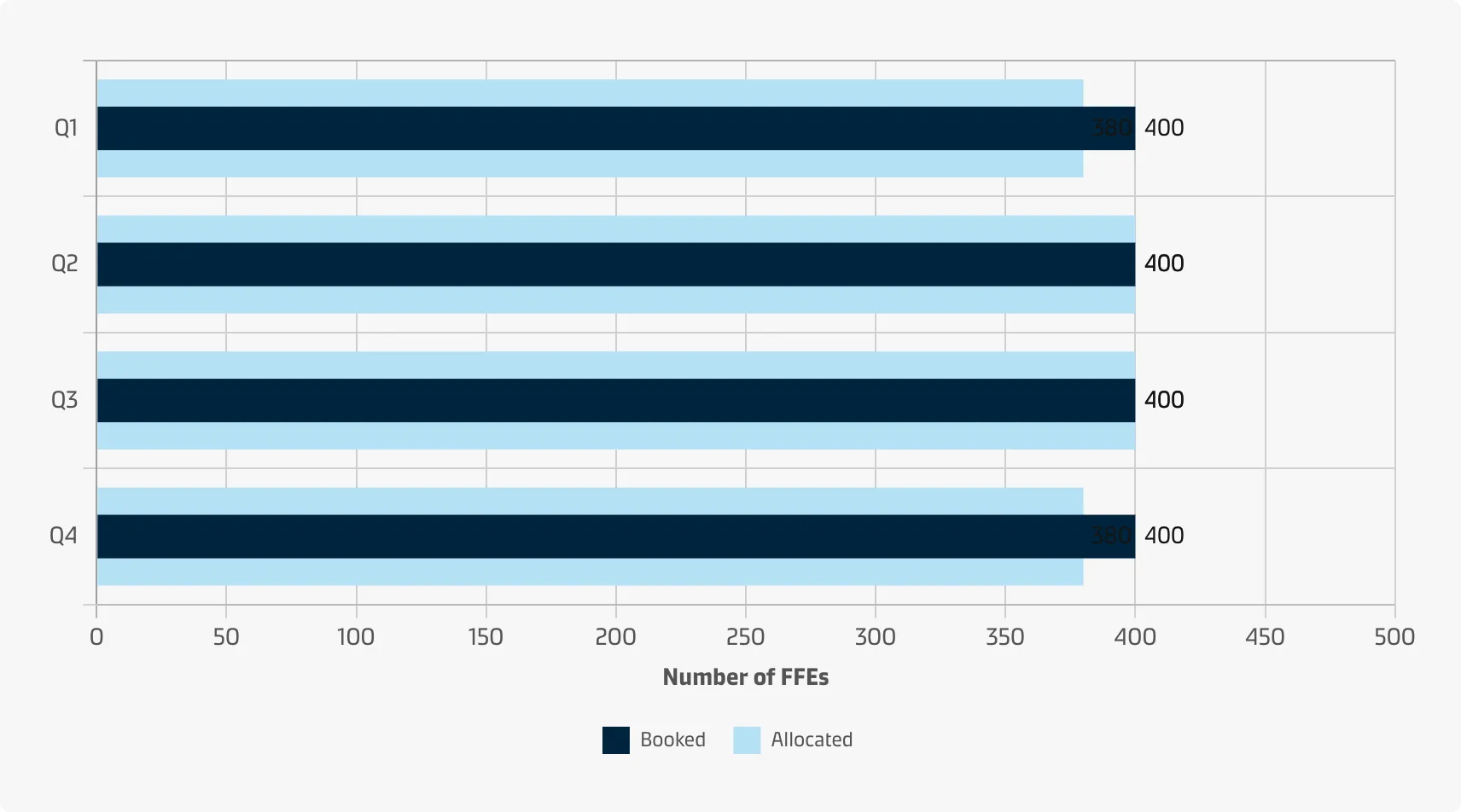
Bullet chart
Bullet charts enhance each bar with additional markings to show that bar’s value in relation to thresholds and target values. This is usually in the form of a perpendicular line showing the target value, but background shading can also be used to provide additional performance benchmarks.
Compared to the other types of performance charts (i.e. Pie/donut chart, Meter chart), a bullet chart allows you to fit the visualised data into a compact space. In addition, you can visualise data by either percentages or integer values (whereas pie/donut charts can only show percentages).
Vertical
Horizontal
Horizontal (advanced)

Best practice
Use a sequential colour scheme to illustrate the thresholds
When choosing colours for the qualitative scale (thresholds) use distinct intensities of a single hue from dark to light (darker colours for the unwanted states and lighter colours for the favourable states). See the Chart style guide and Colour best practice pages for additional guidance on appropriate colour choices within the Maersk colour palette.
Use bar direction to show ‘favourable’ vs. ‘unwanted’
Bullet bars may both represent metrics which are considered good when they are high (e.g. revenue) and others that are considered good when they are low (e.g. expenses). If background fills are used as the only means to show thresholds the user might overlook them. In that case, consider reversing the bar direction for metrics which are supposed to be low.