Button Group
Best practice
- Use button groups to group meaningfully related actions, such as edit, archive, and delete.
- Limit button groups to 4 or 5 items and keep labels short so all buttons remain visible across screen sizes.
- Do not use button groups for navigation between pages or major views. Use Tree Navigation or Tabs components.
- Keep content type consistent within a group, e.g. all icon-only or all label-only.
- Use the “bordered” variant for dense toolbars, table actions and other core workflows.
- Use the “borderless” variant when you want a lightweight control where only the active/selected option shows a container.
- Use the “rounded” variant only when the group represents filters or toggles, e.g. turning search filters on and off.
- Keep all buttons in a button group the same variant and fit.
- Button groups configured as single or multi-select may be used in simple forms and filters, for example, as an alternative to a radio group or a checkbox group. See the selection components guideline.
Variants
Button group supports three variants: “bordered”, “borderless”, and “rounded”.
Bordered
The bordered button group has a visible container. Useful for toolbars with immediate actions and compact controls where higher affordance is important.

Borderless
The borderless button group has no visible border.
Useful for lightweight, subtle mode switches or view toggles where the surrounding UI already provides strong structure. Use when you want minimal visual noise but still provide utility controls to the user.

Rounded
The rounded button group is intended for filter and toggle contexts. Useful for quick filters in dashboards, lists and tables where users toggle multiple criteria on/off. Avoid using it for primary call to actions and form footers.

Orientation
Horizontal button group
The horizontal orientation works well with all the available variants and is the default orientation for the button group component. Use the horizontal button group in proximity to the items that are typically impacted by the actions and selection options in it.

Vertical
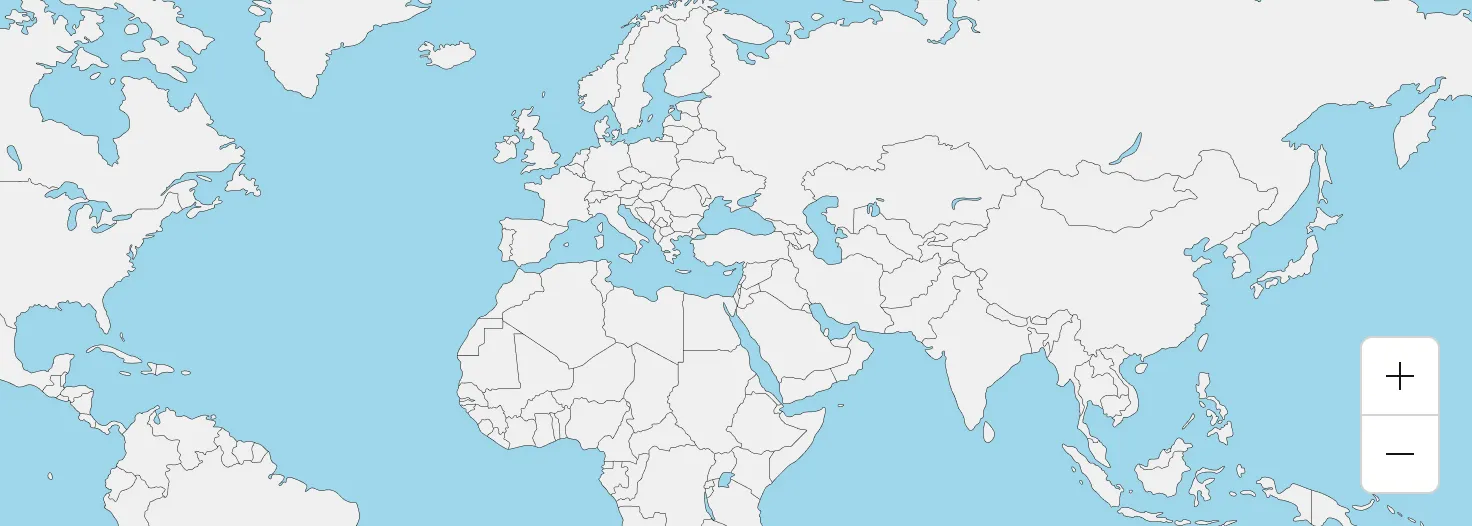
The vertical orientation is ideal for cases when you need a compact cluster of actions overlaid on content, such as map controls. It does support labels, but the recommended use is as an icon-only button group.
Usage
The button group is useful in dense interface applications where users need to perform multiple related actions. Grouping actions and controls helps users scan and understand the available options faster, while keeping the UI organised. Below, you can find a few examples of potential applications of the button group component:
Filter experiences
The rounded button group variant can be used for simple filters or toggles. Use both single and multi-select options with concise labels to create a more prominent filtering experience.

Lightweight utility controls
Use the borderless variant when you want the group to read as lightweight controls, with emphasis only on the active selection.

Getting user feedback
The button group supports single and multiple selection types. This kind of usage should not replace the standard form controls, such as radio buttons and checkboxes, and it should only be used sparingly for simple forms and flows to collect user input.
