Input Time
When to use
- The user needs to enter or select a single time, using touch, mouse, or keyboard.
- The time belongs to a specific date, so the user sets the date and the time together.
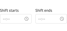
- The user needs to select a time range, such as a start and an end time.
When not to use
- If the user only needs to enter a date, use Input Date instead.
Usage guidance
Make the field understandable: say which time it asks for, where the label sits, which time zone applies, and which format and minute options the user sees. The Forms and Date & Time guidelines cover the wider experience for people using your product.
Label the field and place the label above it where possible
Use the label and hint text to make clear what time the user is picking.
The label sits above the field by default. It can also sit to the left. Use the top-positioned label wherever possible, especially in forms. For the reasoning, see label positioning in the form guidelines.
Show which time zone applies
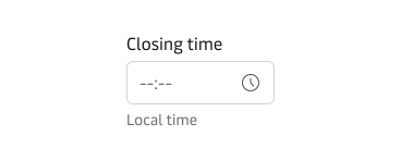
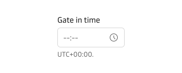
Help the user understand which time zone the selected time belongs to when the time belongs to a place or is read by people in several time zones, for example in the label or hint text. Not every Input Time needs a time zone statement.
Use local time when the time belongs to a place, such as a port departure. Use a UTC offset when the time must read the same for people in several time zones, such as a booking cut-off. When you name a zone, follow the time zone guidance in the Date & Time guidelines, which recommends UTC offsets over alphabetical abbreviations because abbreviations can be ambiguous.
Use the 24-hour clock
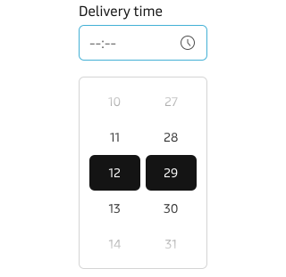
Show times on the 24-hour clock, as the MDS Date & Time guidelines recommend. It minimises misunderstandings and is well known in the shipping industry. See the 24hr clock guidance for the written format.
Consider fewer minute options
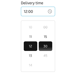
Minutes run from 00 to 59 by default. When exact minutes are not needed, consider offering fewer options, such as quarter-hour intervals (00, 15, 30, and 45).
Follow Input guidance for the vanity variant
Input Time supports the vanity variant. Read the Input vanity guidance before you use it.
Patterns
Input Time is combined with other fields in two recurring compositions.
Date and time together
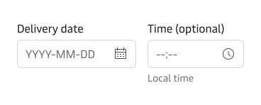
Combine Input Time with Input Date when the time belongs to a specific date. Show them as separate fields or in an Input Group. Use separate fields by default. Use an Input Group only when all of its conditions are true. If any condition for separate fields is true, use separate fields.
Use separate fields when any of these is true
- The time is optional.
- Each field needs its own hint or error message.
- One date has more than one time.
Use an Input Group only when all of these are true
- The date and time are one moment, such as a delivery slot.
- The user must fill in both.
- One label, one hint and one error message work for both fields.
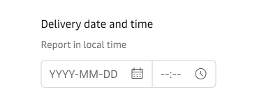
For the full guidance, including the group’s visually hidden field labels, see Date and time together on Input Date.
Time range
When the user needs to select a time range, use two Input Time fields together. The end time should be after the start time. If it is not, provide an error message that says what is wrong, such as “End time must be after start time.”
Content guidance
- Use natural language and the terms people expect in labels and hint text.
- Name the field, such as “Departure time”, instead of using a verb such as enter, add, or input.
- End the label without a colon (:).
- For hint text, see hint text on the Input component.
For how to write consistent labels, see the Label guidelines.
States and feedback
Input Time follows the Input component for its error state. See error state for when to validate and how to recover.
Accessibility
The component ships with accessibility and keyboard support, so your part is the content around it.
- Always provide a label, even when the design hides it. A hidden label still names the field for assistive technology.
- In an Input Group, give each field its own label and hide it visually, because the group label is already shown.
- Say which time the field asks for in the label or hint text. When the time belongs to a place or is read by people in several time zones, say which time zone applies too.
- When the field is invalid, provide an error message that says what is wrong with the time. The red border alone does not say it.
Related components
| Component | Use case |
|---|---|
| Input Date | When the user enters a date, alone or beside a time |
| Input Group | When the date and time are one moment and share one label, hint and error message |
| Input | When the value is freeform text, not a time. Input also holds the shared hint text, error state, and vanity guidance. |