Accordion
When to use
- The content is a set of related topics that each make sense on their own, such as FAQs.
- Users need only part of the content, but the relevant part differs between users.
When not to use
- If all users need the content to complete a task or make a decision, show it directly, because scrolling takes less effort than expanding every item.
- If the page has little content, show it directly.
- Avoid using an accordion if users need to compare content across items.
- If users need to switch between different views of related content and view one at a time, use Tabs instead.
- If users need to navigate hierarchical content with expandable and collapsible navigation items, use Tree Navigation instead.
Usage guidance
Decide how items expand and how the accordion looks. In this guidance, “items” means accordion items.
Choose how items expand
- Use multi-expand to let users open several items. It is the default, and each item stays open until users close it.
- Use single-expand when users need to focus on content from one accordion item at a time, or when the items are mutually exclusive. Single-expand, also called a conditional accordion, closes the open item when another opens.
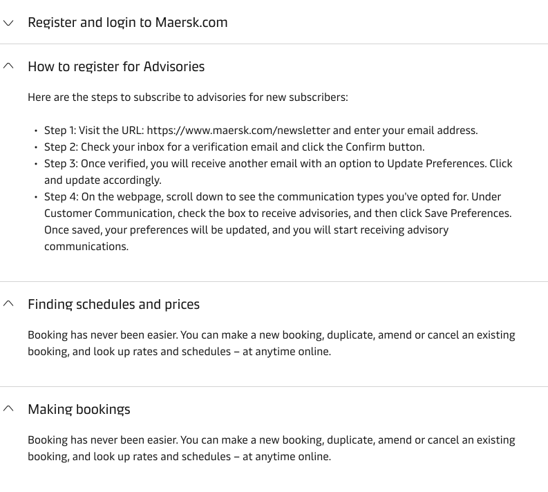
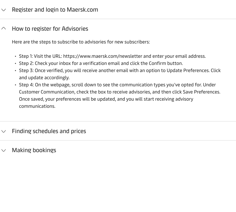
Choose the expand icon position
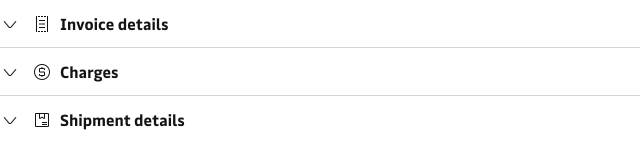
The expand icon is on the right by default, which keeps the heading and body aligned with the surrounding content. To make the accordion stand out, put it on the left. This indents the heading and body, which breaks the alignment with the surrounding content.
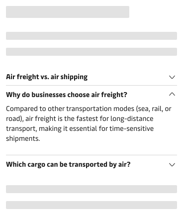
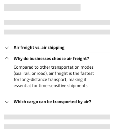
Add an icon to a heading
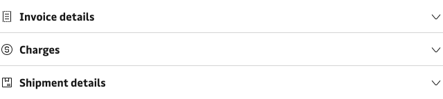
You can add a leading or trailing icon to a heading. Keep it apart from the expand icon, because two icons side by side add visual noise.
Add a border
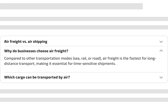
By default, an accordion has no outer frame or background. Add the border to give it a rounded outline and a white background, so it looks as if it sits in a card. Do not add it when the accordion is already inside a card or another container with a border.
Patterns
Common ways to use an accordion in a page layout.
Keep the accordion concise
Limit the number of items so the accordion does not become overwhelming. Aim for no more than 7, but use more when needed. For example, an FAQ may need more items to cover the relevant questions. If the list becomes difficult to scan, consider grouping related content into separate accordions or revisiting the content structure.
Choose where to place an accordion
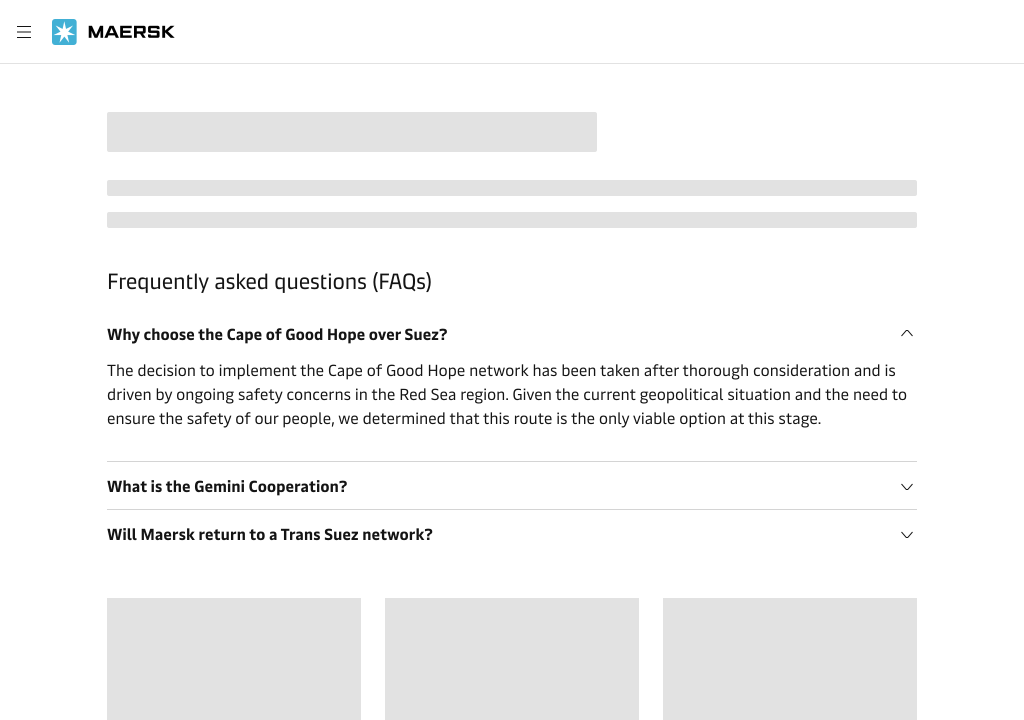
Place an accordion in the main content area, or inside a Drawer or a Card.
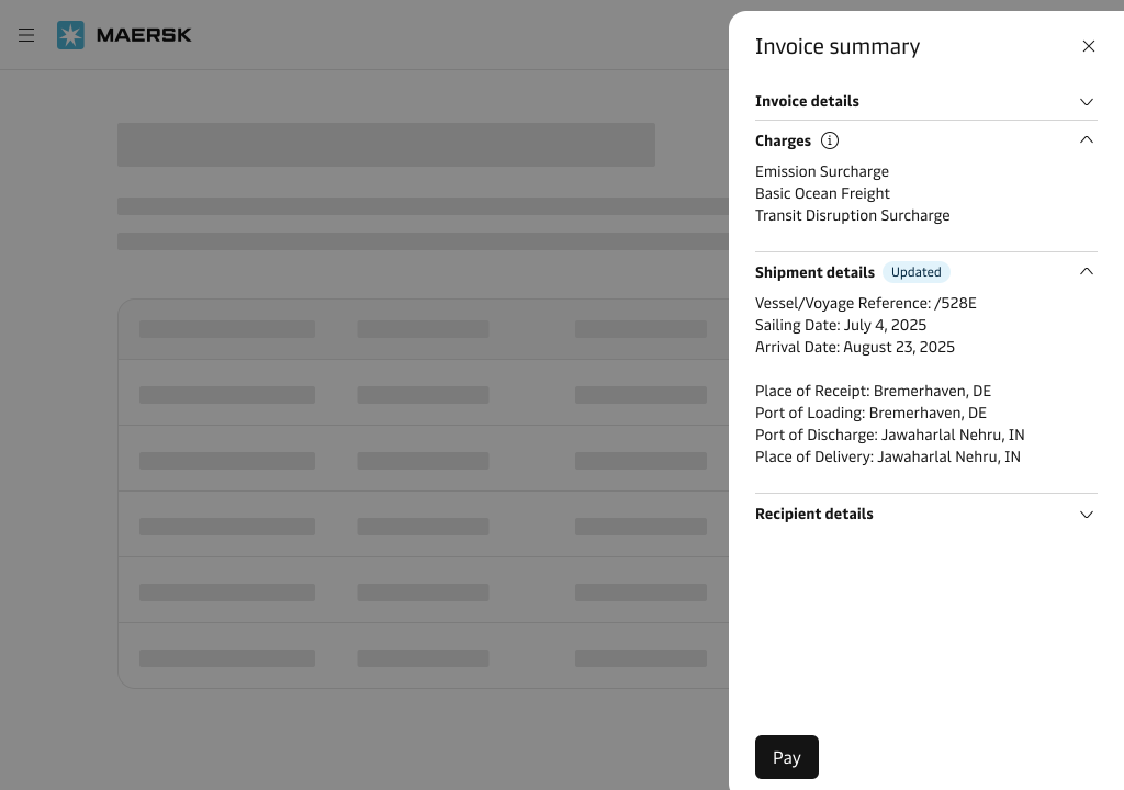
Avoid nesting accordions
Avoid putting an accordion inside another accordion. Nesting makes content harder to follow and navigate. Consider splitting the content into separate accordions or pages, or organising long content with subheadings and paragraphs.
Content guidance
Write each heading so it says what the item contains, and keep every heading distinct. Use “Invoice details” instead of “Info”. The headings form an outline that users scan to decide which items to open.
- Write item headings in sentence case. A heading can be a short sentence, such as a question in an FAQ.
- In an item that contains text, write one idea per paragraph. If the content has more than one part on the same topic, use subheadings so users can scan it.
- If an item covers more than one distinct topic, split it into separate items.
For how to write and format content, see the Content guidelines and Labels.
Accessibility
Keyboard users press Tab to move between item headings, and Enter or Space to expand or collapse the focused item.
Related components
| Component | Use case |
|---|---|
| Tabs | When users need to switch between different views of related content, one at a time |
| Tree Navigation | When users navigate hierarchical content through expandable navigation items |