Copy Button
When to use
- The user needs to copy a text-based value accurately for reuse in another context.
- The user needs an immediate response after activating the copy action.
- The user needs to repeat the same copy action across many rows or items.
When not to use
- If the interaction performs an action other than copying content, such as downloading or exporting content, use Button instead.
- If the user needs to view and copy a code example, use Code Preview instead.
- If the user needs to copy responses from an AI conversation, use Chat instead.
Usage guidance
Choose the button’s style from where it sits relative to the value, then decide how visible it should be.
Match the style to the placement
When the Copy Button sits directly next to the value it copies, use the icon-only button. Keep the default plain, neutral style with compact padding. Match the fit to the value’s text size, following Button’s fit guidance: use the small fit for extra small text and, for headings, the large fit with default padding. For spacing values, see the spacing guidelines.
When the Copy Button is not directly next to the value it copies, show a label that names what it copies and use the outlined variant with default padding. Follow Button’s fit guidance. In a group with other actions, use the same variant and fit as those actions.
Keep the button visible by default
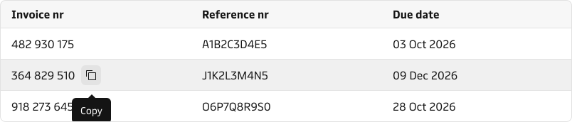
Show the Copy Button by default so users can see that copying is available. In dense interfaces where repeated copy actions create visual noise, such as data tables, hide the button until the pointer reaches the value or keyboard focus reaches the button. Use the show on hover option for this, and only with the icon-only Copy Button.
Patterns
A recurring way to pair Copy Button with the values users carry into other systems.
Copyable values in a table
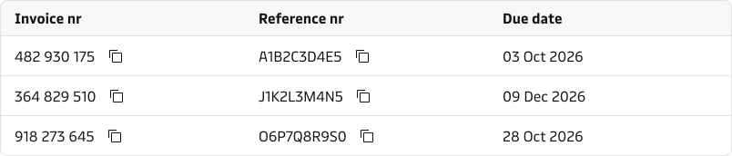
Add an icon-only Copy Button to table values that users carry into another system, such as invoice numbers, container numbers, or booking references. To reduce visual noise, hide the button until the pointer reaches the value it copies or keyboard focus reaches the button.
Content guidance
Screen readers read out the Copy Button’s name. The tooltip is separate from the name: by default it shows “Copy”, whatever the name is. If you change the tooltip text, keep it short, as a longer tooltip adds visual noise.
- Icon-only button: it has no visible label, so its name is only read out. Use “Copy” when only one kind of copyable value appears on screen. When different kinds appear on the same screen, name the value, for example “Copy container number”. In a table with more than one kind of copyable value, name each button for the kind of value in its column.
- Button with a visible label: show a label that names what will be copied, for example “Copy invoice number”. The label is also the button’s name.
- Don’t use the copied value itself as the label. Use “Copy invoice number”, not “123 456 789”.
- Write labels in sentence case, capitalising only the first word and proper nouns.
See Labels for broader writing guidance.


States and feedback
- Default: the button shows only the copy icon, and screen readers still read out its name. Show a visible label alongside the icon when the button is not directly next to its value.
- Hover: follows Button’s hover state and shows a “Copy” tooltip.
- Focus: follows Button’s focus state and shows a “Copy” tooltip.
- Show on hover: the button stays hidden until the pointer reaches the value it copies or keyboard focus reaches the button.
- Copied: when the user activates the button, the copy icon changes to a checkmark and the tooltip changes from “Copy” to “Copied”. The label text doesn’t change. Screen readers announce “Copied” without naming the value.
Accessibility
- The accessible name comes from the label, even when the label is hidden. A separately set name (the arialabel property) takes priority over it. Set one only when it must differ. The tooltip text isn’t part of the name.
- In a table, name buttons as set out in Content guidance. Don’t repeat the row’s identifier in each name; it adds noise, not clarity.
Button handles keyboard access.
Related components
| Component | Use case |
|---|---|
| Button | When the interaction performs an action other than copying content. |
| Code Preview | When the user needs to view and copy a code example. |
| Chat | When the user needs to copy responses from an AI conversation. |
| Tooltip | When the user needs contextual information without taking any action. |