Date Range
When to use
- The user needs to select a span of dates, such as a free-storage period.
- The end date depends on the start date, and the two dates must be in the right order.
When not to use
- If the user needs to give only a single date, use Input Date instead.
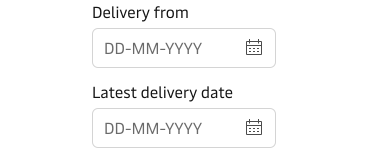
- If the two dates are not one time span, such as a delivery date and an invoice date, use two Input Date fields.
- Date Range collects dates only. If the start and the end also need a time, use Input Date with Input Time for each. See Date and time together.
Usage guidance
Read the Form Guidelines first. They cover many basic recommendations to take into account when working with forms.
Date Range is built on Input Date. Typing or picking dates, the date format, limiting dates and week numbers work the same way, and are summarised here so you don’t need to switch pages.
Let people type or pick the dates
Date Range supports both typing the dates and picking them from the calendar popover by default. You do not need to choose one over the other.
Date format & placeholder text
Use the placeholder to show the date format you ask for. Do not use it instead of labels. The default format is the ISO standard, YYYY-MM-DD. Change it to meet local requirements and user expectations.
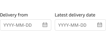
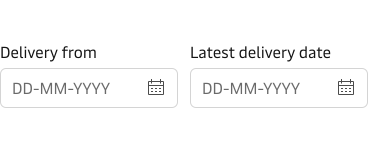
An input mask is optional extra help for typing the dates. It is off by default and follows the date format. Use no more than one of placeholder, hint or mask unless each is needed. See the Input masks guideline and Show format help on Input.
For how Maersk writes dates and times in general, see the Date and time guideline.
Limit the selectable dates
Set min and max dates to help prevent user error, and keep them realistic for the context. If a user types a date beyond the minimum or maximum the field shows an error message, and the calendar popover disables the days beyond it.
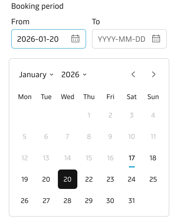
Show week numbers only when users expect them
Show week numbers in the calendar popover only when users expect them, for example European planning teams that refer to “week 14”. Week numbers follow the ISO 8601 standard and are mainly used in Europe and parts of Asia. They are not widely used in the U.S., Canada, Australia or New Zealand. They appear only in the popover. The fields show plain dates. For more, see Calendar.
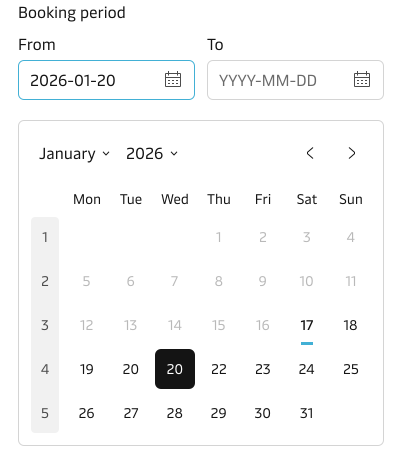
Orientation
By default, Date Range is responsive and adapts to the immediate container it is placed within: the fields share one row when there is room and stack when there is not. You can force either horizontal or vertical orientation. On small screens (up to 640 px wide) the fields switch to vertical by default, even when you force horizontal, so a forced horizontal layout does not hold there.
Content guidance
- Write the legend to describe what the two dates are for, such as “Storage period”.
- For labels, use natural language and the terms the user would expect.
- The label should describe what to input and not how.
- Don’t use verbs like enter, add or input in the label.
- Don’t add a colon ( : ) at the end of the label.
- Use the hint text if additional context and explanation are needed. See the Input component for details.
- Date Range supports only one hint and one error message per field, for the start date and the end date separately. There is no group-level hint or error message.
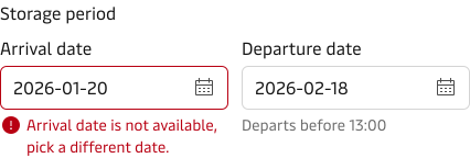
- Error messages should be clear, concise and provide actionable remedies to resolve the errors. See the error state on the Input component and the error messages guideline.
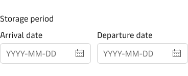
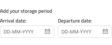
For how to write good and consistent labels, see the Label guidelines.
States and feedback
Date Range has the same states as Input and Input Date. Loading, disabled and read-only apply to both fields together. The error state is the exception: each field shows its own.
- Focus: works as on Input Date.
- Loading: both fields show a spinner in place of the calendar icon.
- Disabled and read-only: set on the whole Date Range, so both fields change together. See Disabled and read-only on Input Date for when to use each.
- Error: only the field with the problem shows the error state, with its own error message. Nothing is shown for the pair. See Error state below.
Error state
Write each error message for the field it belongs to. See the error state on Input Date and the error state on Input for when to show an error and how to write the message.
Accessibility
Standard keyboard and screen reader behaviour is built into the component. These points depend on you:
- Give the group a legend that names what the two dates are for. You can hide the legend visually only when the context already makes this clear. It then remains the accessible name of the group only.
- Keep a clear label on each field, so that the start date and end date fields can each be identified without the surrounding page.
- Show the expected format in visible text, using the placeholder or a hint.
- Write error messages for each field that name the problem and tell the user how to fix it. See the error messages guidelines.
For the accessibility guidance shared by input fields, see Accessibility on Input. For how to group fields with a legend, see Group and space fields in the Form guidelines.
Related components
| Component | Use case |
|---|---|
| Input Date | When the user needs to give only a single date |
| Calendar | When the layout needs the month grid on the page itself for single date selection, and for guidance on limiting dates and showing week numbers |
| Input | For hint text, error state and accessibility guidance shared by input fields |