Input Date
When to use
- The user needs to enter one date, such as a delivery date, either by typing it or by picking it from a calendar.
- The user needs to give a time that relates to a specific date.
When not to use
- If the user needs to select a span of dates, such as a free-storage period, use Date Range instead.
- If the layout needs the month grid itself rather than a field that opens one, use Calendar instead.
- If the user is entering only a time, use Input Time instead.
Usage guidance
Read the Form guidelines first. They cover the basic recommendations for working with forms.
Let people type or pick the date
Input Date supports both typing the date and picking it from the calendar popover by default. You do not need to choose one over the other.
Ask for the date in a recognisable format
The default input format is the ISO standard, YYYY-MM-DD. You can change the input format when the context needs it, for example to match the format of an official document. Make it clear which input format you are asking for, for example by using the placeholder.
An input mask is an optional extra help for typing the date in the expected format. Input Date has a mask setting that is off by default and follows the input format. For the mask itself, including whether a field with a mask also needs visible format text, see the Input masks guideline and Show format help on Input.
- When you ask for a date from an official document, such as a passport, match the input format of the original so that it is easy for the user to copy. If the original uses a different format from the default, change the input format to match it.
- When you ask for a memorable date, such as a date of birth, consider using 3 text inputs (day, month and year) to represent the correct format.
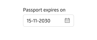
For how Maersk writes and formats dates and times in general, see the Date and time guideline.
Limit the selectable dates
Set a minimum and a maximum date to help prevent user error. The selectable dates should be realistic for the context and for what the application can do. For example, a pickup date that cannot be in the past should not offer past days. A typed date beyond the maximum should show an error message, and the calendar popover disables the days beyond it.
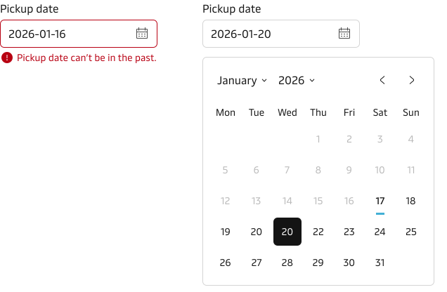
The field opens the Calendar in a popover, so the Calendar guidance on limiting the selectable dates and customising day styles applies here too.
Show week numbers only when users expect them
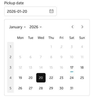
Display week numbers in the calendar popover only when the context requires them and when users expect to see them by default. The Calendar page describes which audiences expect week numbers.
Week numbers are shown only in the calendar popover, not in the input field. The field itself shows a plain date in the input format.
Put the label above the field
By default, the component has a top-positioned label. You can change the position of the label to left-positioned. Use top-positioned labels wherever possible, especially in forms. For why, see label positioning in the Form guidelines.
Vanity variant
The component supports the “vanity” style variant. Read more about this variant in the Input vanity guidance.
Patterns
Date and time together
If you need a date and a time, use Input Time with Input Date. You can show them in two ways: as separate fields or in an Input Group. Use separate fields by default. Use the Input Group only when the date and time are one moment.
Use separate fields when
- Each field needs its own hint or error message. For example, the date has a maximum date and the time has opening hours.
- The time is optional, or the user sets the date and the time at different moments.
- The fields must stack on small screens or line up with other fields in the form.
- One date has more than one time.
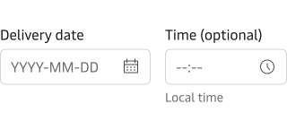
Use an Input Group when
- The date and the time are one moment, such as a delivery slot or a deadline.
- The user must fill in both.
- One label, one hint and one error message work for both fields.
- There is enough width to show both fields side by side.
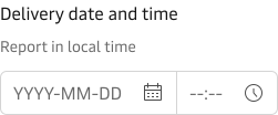
The Input Group shows one label, one hint and one error message for both fields. Each field inside the group still needs its own label for screen readers. Hide it visually, because the group label is already shown.
Content guidance
- Use understandable and contextual language for the input label that describes what the date is for.
- Don’t use verbs like enter, add or input in the label.
- Don’t add a colon ( : ) at the end of the label.
- Use the hint text to provide additional context and explanation. See the Input component for details.
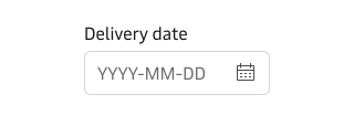
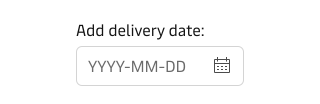
For how to write good and consistent labels, see the Label guidelines.
States and feedback
Input Date has the same states as Input. This section covers where Input Date works differently. Default and hover are the same as on Input.
Loading state
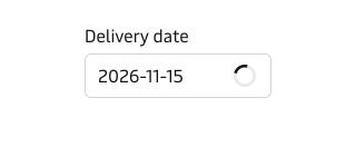
Use the loading state when a date is checked while the user waits, for example against a server to see if a pickup date is available. If the check cannot finish, keep the date and do not mark the field as an error. See Loading state on Input and separate invalid data from an unavailable check.
Disabled and read-only
Use disabled when the user cannot set the date yet, for example a return date before a pickup date is chosen. Use read-only when the date must stay visible but not change, for example a confirmed booking date. If you only want to stop some dates, set a minimum and a maximum date instead. See disabled and read-only states.
Error state
By default check the date when the user leaves the field or submits the form, not on every key press. Show an error when the date cannot be accepted, for example when it is before the minimum, after the maximum or not in the expected format. Remove the error as soon as the date is valid.
Accessibility
Standard keyboard and screen reader behaviour is built into the component. These points depend on you:
- Write a clear, descriptive label that can identify the date without the surrounding page. Hide it visually only when the purpose is already clear from the context.
- Without a mask, show the expected input format in visible text, using the placeholder or a hint. For a field with a mask, follow the Input masks guideline.
- Write error messages that name the problem and tell the user how to fix it. See the error messages guidelines.
For the accessibility guidance shared by input fields, see Accessibility on Input.
Related components
| Component | Use case |
|---|---|
| Input Time | When a time needs to be related to a specific date |
| Date Range | When the user needs to select a span of dates, such as a free-storage period |
| Calendar | When the layout needs the month grid on the page itself |
| Input | For hint text, error state and vanity variant guidance shared by input fields |